Zahir Sans Font - A Modern Humanist Sans-Serif Typeface for Editorial & Apps
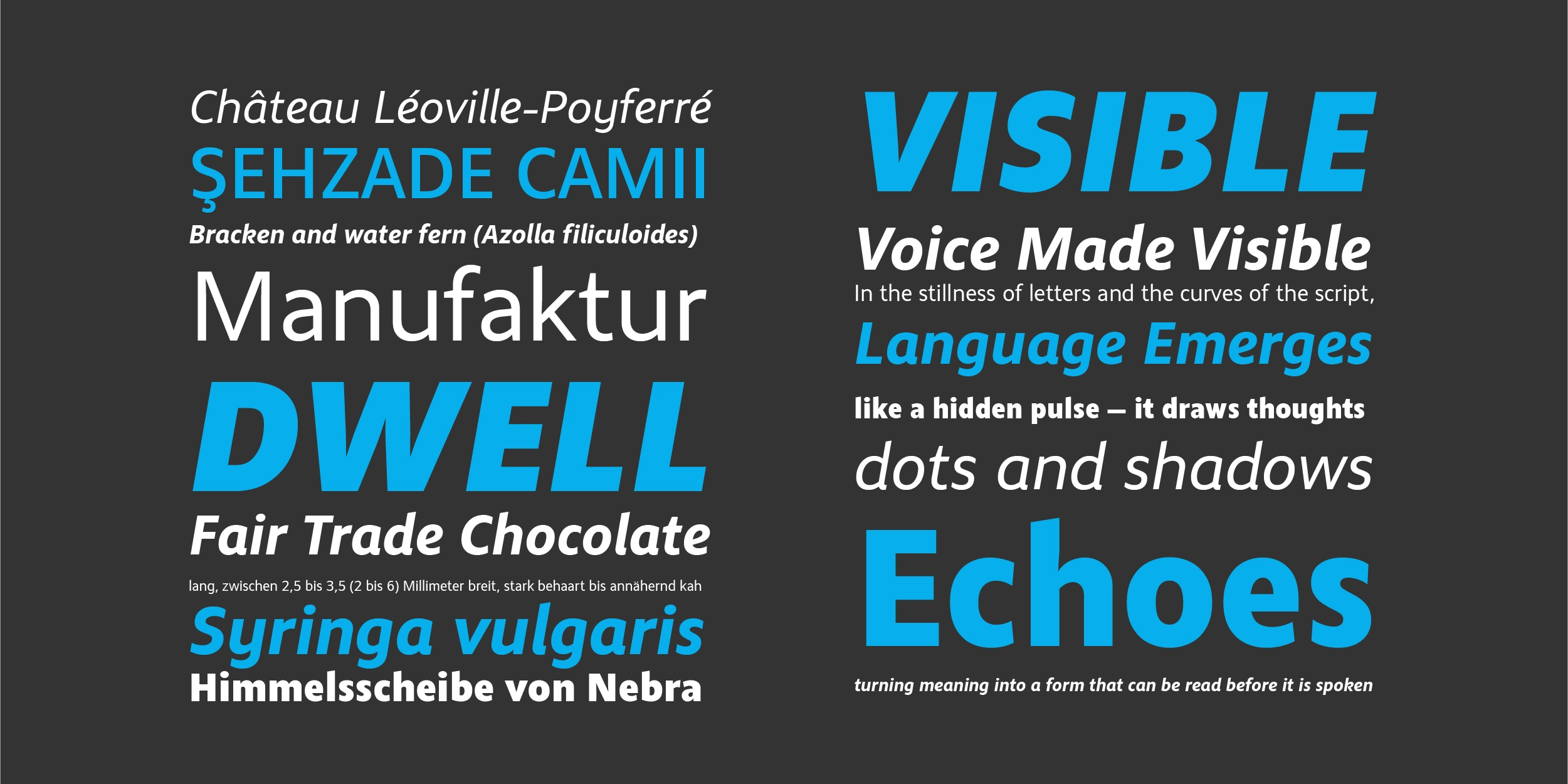
Good typography shouldn't announce itself, it should simply make everything easier to read. Zahir Sans is built on that principle. A modern humanist sans-serif designed as a versatile workhorse across both digital and print environments, Zahir Sans combines the clarity of contemporary type design with the warmth that only a humanist approach can deliver. For apps, editorial layouts, interfaces, and bilingual Latin–Arabic design systems, it's a typeface that earns trust quietly, through consistent readability, controlled proportions, and a personality that feels neither cold nor casual.
Design Inspiration & Naming
The name Zahir derives from the Arabic word ظاهر, meaning "visible," "clear," or "that which is apparent." In Sufi philosophy, Zahir represents the external, observable dimension of reality, the surface that is plainly seen. As a name for a typeface, it sets a clear design intention: this is a font built around legibility and clarity, where nothing is hidden or ambiguous, and every letterform communicates with directness.
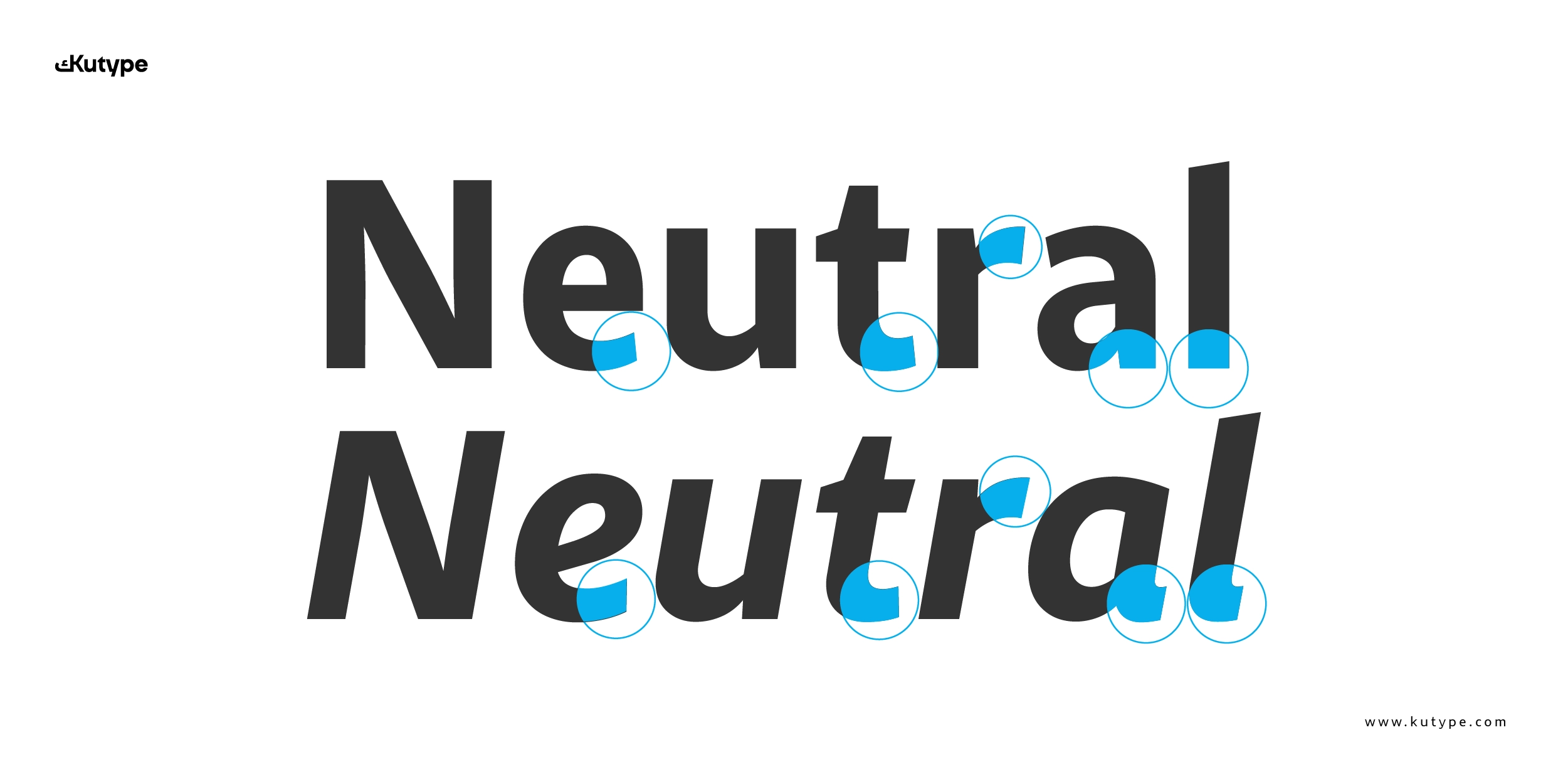
The design takes clear inspiration from Myriad, the widely respected humanist sans-serif used extensively by Apple across its product ecosystem in the 2000s, known for its clean structure and warm approachability. Zahir Sans shares Myriad's humanist DNA but pursues its own refinements. A notable example is the lowercase "b", where Zahir adopts a simpler, more connected form at the base rather than a traditional curved terminal. This seemingly small decision has a measurable impact on readability, reducing the visual complexity of each character and creating a more fluid rhythm across running text.
If you enjoy this Humanist Sans design, you may also like Ramis for a fresh creative alternative.
Key Design Characteristics
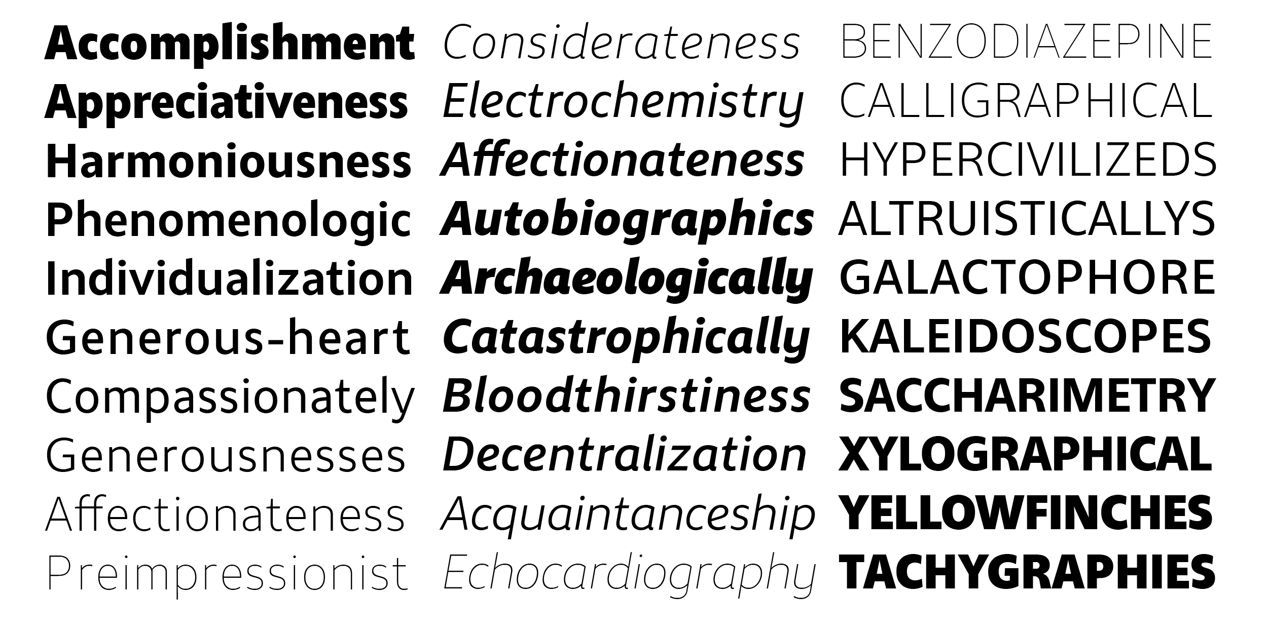
Zahir Sans Modern Humanist Sans-Serif font is a humanist sans-serif, a category that sits between the warmth of serif typography and the clarity of geometric or grotesque sans. As Fontfabric's definitive guide to humanist fonts explains, humanist sans-serifs are considered highly legible because their letterforms, with varying stroke widths, open counters, and generous spacing, closely resemble natural handwriting, which the human eye is inherently accustomed to processing.
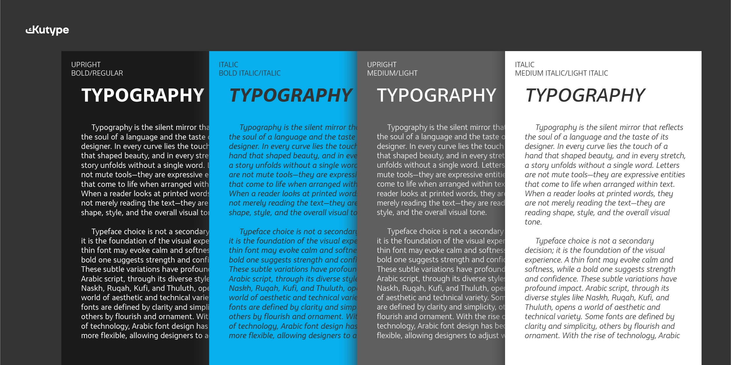
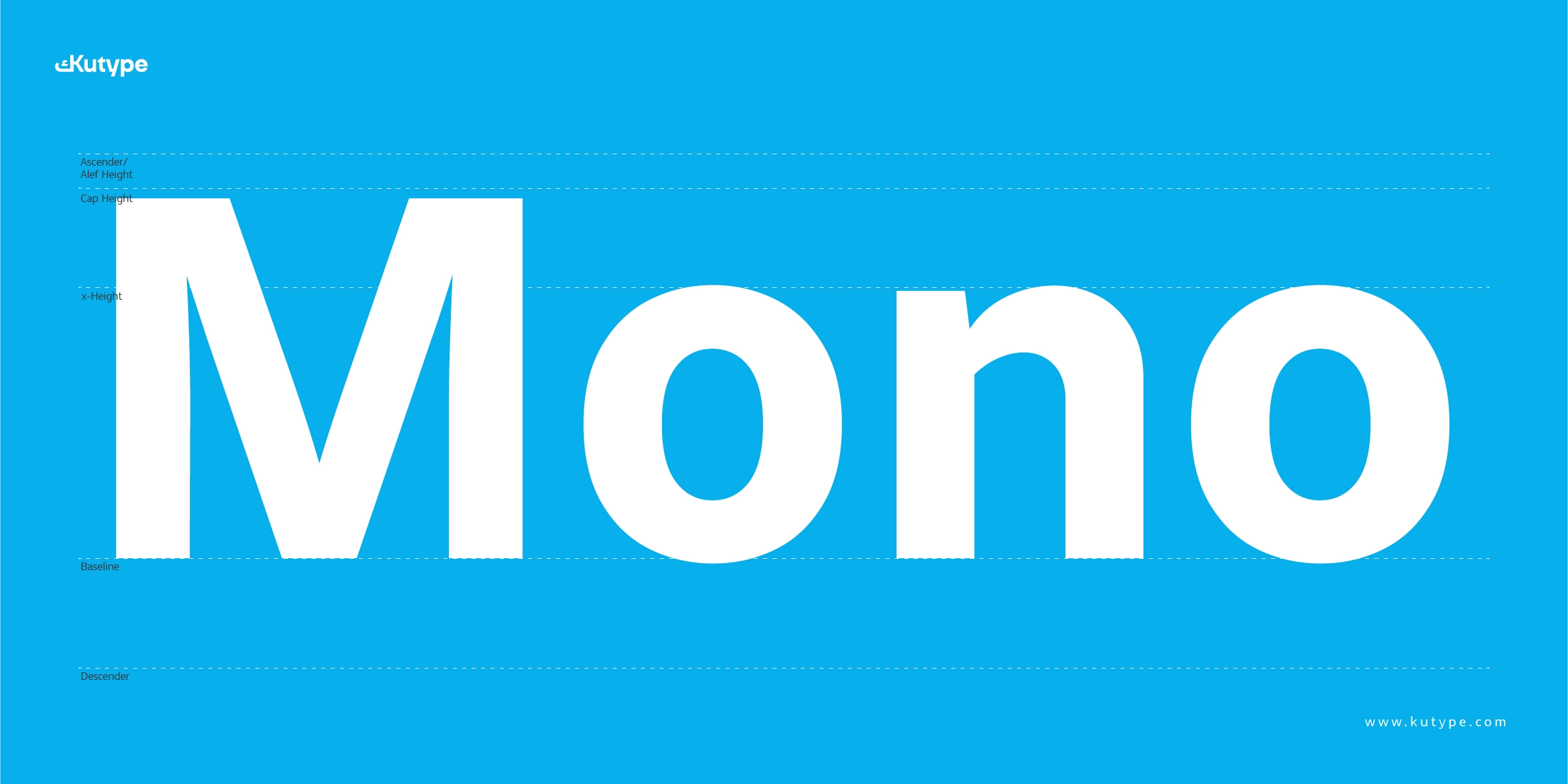
The practical implications of this are significant. Research covered by UX Movement on how sans-serif styles affect readability found that humanist typefaces are measurably faster to read than grotesque alternatives, a difference that matters in interface contexts where users scan rather than read, and in editorial contexts where extended reading is the goal. Zahir Sans delivers those same advantages: low stroke contrast for consistent visual density, a controlled x-height that keeps text comfortable across sizes, and proportions that remain stable from display headlines down to small body text.
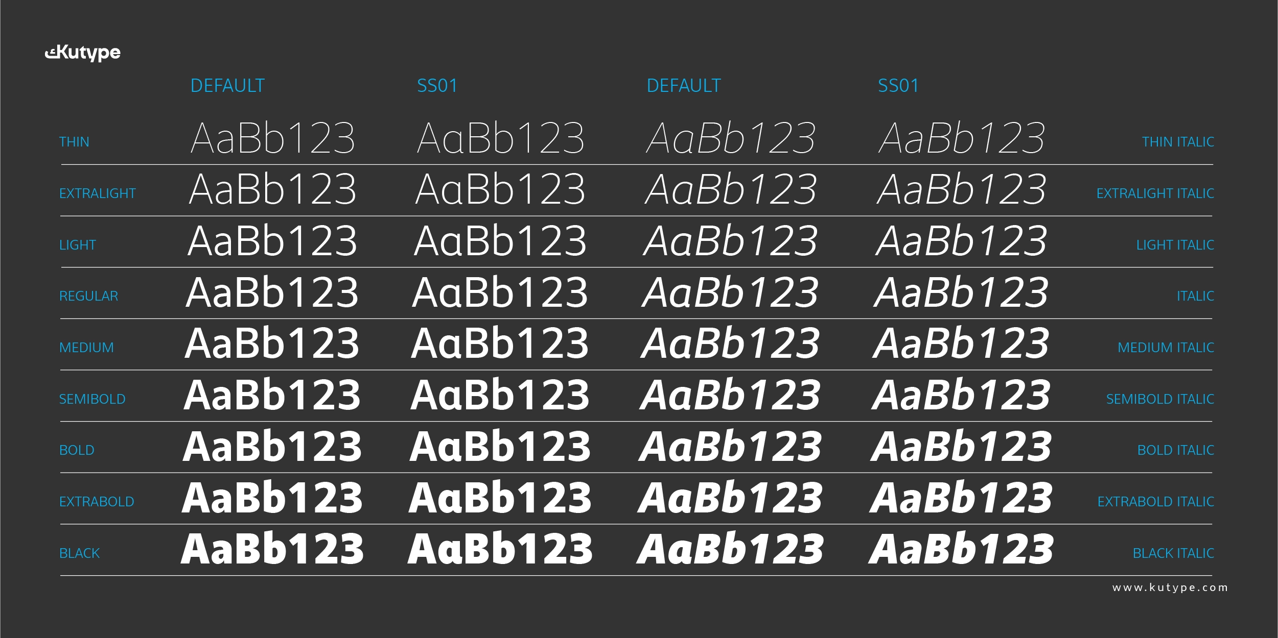
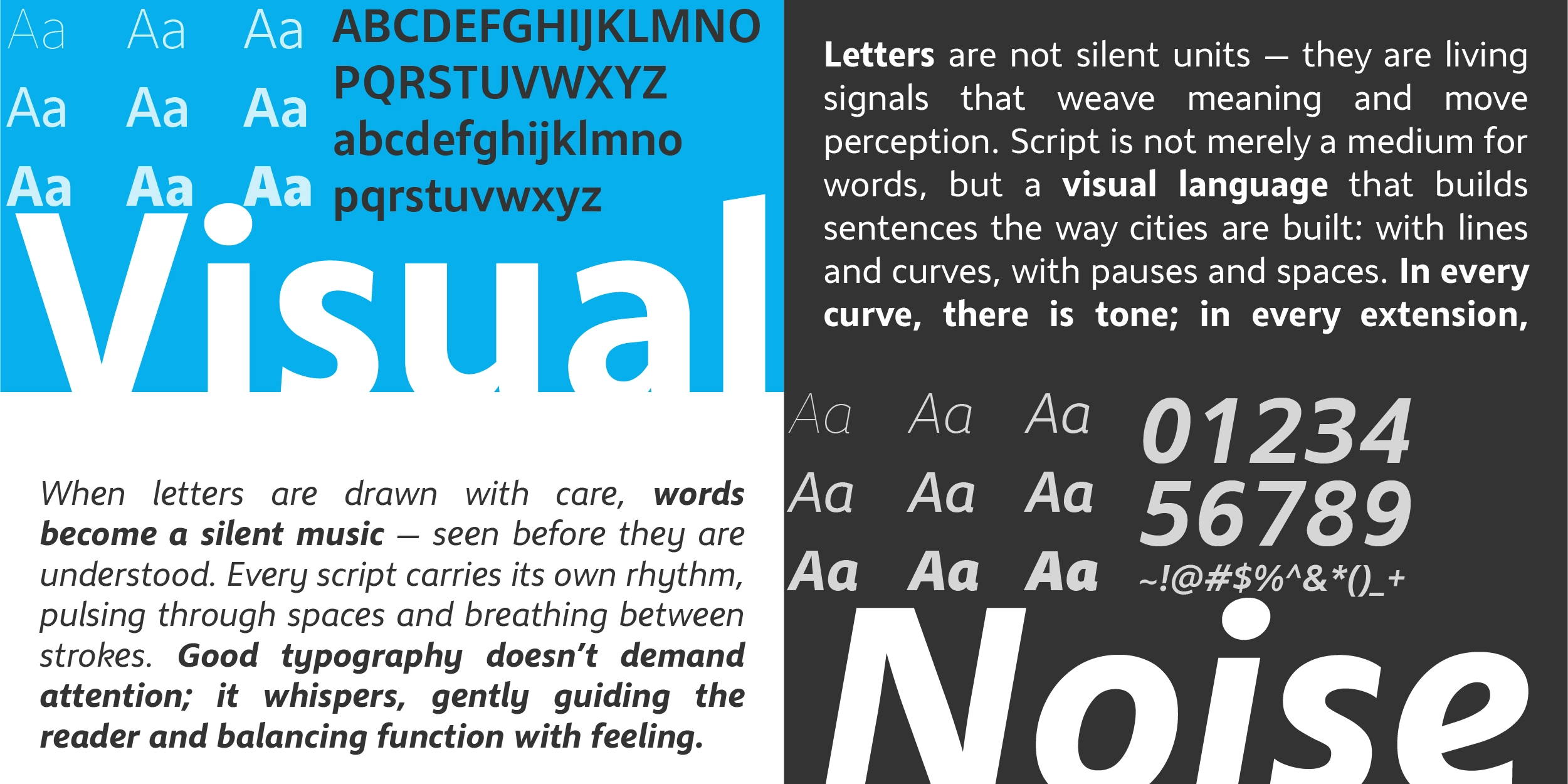
The Stylistic Set (ss01) provides alternate designs for seven characters, a, d, e, j, k, l, and y, giving designers the ability to shift the font's personality subtly between a more neutral register and a slightly more distinctive one, depending on the application.
Features at a Glance
Zahir Sans Modern Humanist Sans-Serif font covers the essentials for professional editorial and interface use:
- Ligatures (liga), standard letter combinations for clean typographic flow
- Stylistic Set (ss01), alternate designs for a, d, e, j, k, l, and y
- Case-Sensitive Forms (case), adjusted punctuation and symbols for all-caps settings
- Fractions & Ordinals (frac, ordn), clean typographic formatting for editorial content
- Superscript & Subscript (sups, subs), support for annotated and academic text
- Localized Forms (locl), correct character rendering across supported languages
Ideal Use Cases
Zahir Sans's combination of humanist warmth and clean structure makes it effective across contexts where sustained readability and visual neutrality are both required.
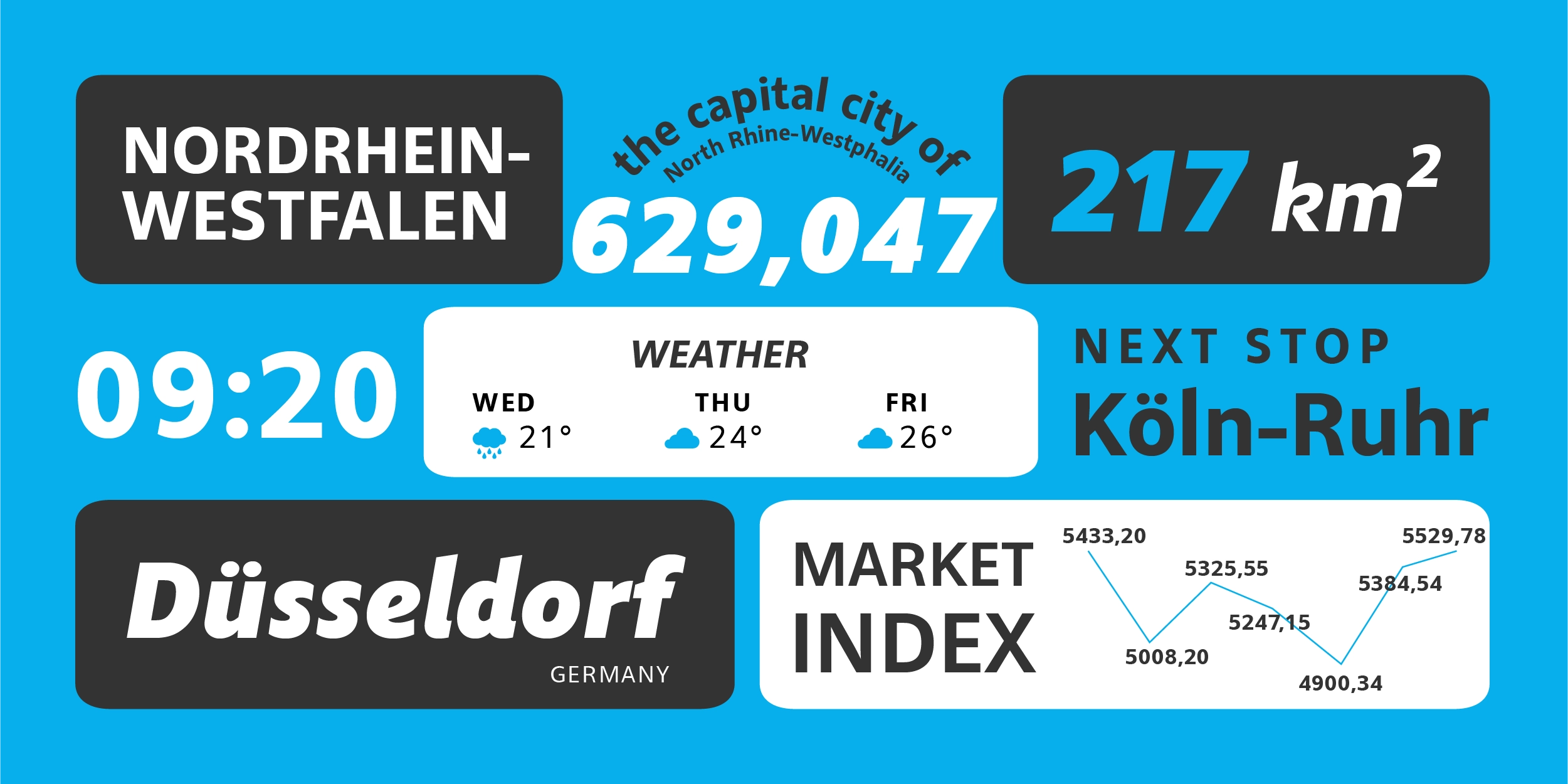
- Apps & Digital Interfaces, its open counters, low contrast, and controlled proportions give it strong performance across screen sizes and resolutions. Whether applied to navigation, body copy, data labels, or button text, Zahir Sans maintains legibility without demanding visual attention, which is exactly what good interface typography should do.
- Editorial Design, for magazines, long-form digital articles, and ePub publications, Zahir Sans holds up across extended reading with the kind of quiet consistency that keeps readers comfortable over time. Its humanist structure gives editorial layouts warmth without compromising the clean, professional tone most publications require.
- Bilingual Latin–Arabic Layouts, as the Latin companion to Zahir Arabic, it forms a cohesive bilingual type system where both scripts share proportional logic and visual character. For brands and publishers working across Arabic-speaking and Western markets, this coherence is genuinely valuable.
- Branding & Identity, for brands that want to communicate clarity, approachability, and modern confidence without the coldness of a geometric sans or the formality of a serif, Zahir Sans occupies exactly the right typographic space.
- Web Typography, its WOFF2 format availability and screen-optimized proportions make it a practical choice for web environments where performance and cross-device consistency both matter.
Looking for a matching Arabic companion? Zahir Sans Arabic complements this typeface beautifully.
Conclusion
Zahir Sans Modern Humanist Sans-Serif font earns its name. Clear, direct, and built to be read, it brings the readability advantages of the humanist sans-serif tradition into a contemporary design tool suited for apps, editorial, and bilingual design systems. The simplified letterform decisions, controlled proportions, and well-considered stylistic alternate set give designers a typeface that performs well at the defaults and rewards deeper engagement. For any project where legibility and quiet professionalism are the goal, Zahir Sans is a reliable foundation.
Font Name
Zahir Sans
Designer
Nur Syamsi, Bustanul Arifin
Version
Build 1.0 - 2025
Type Category
Sans Serif, Body Text, Display
Glyph Count
643+
Year Published
August 2025
Supported Languages
Afrikaans, Albanian, Asu, Basque, Bemba, Bena, Bosnian, Catalan, Cebuano, Chiga, Colognian, Cornish, Corsican, Croatian, Czech, Danish, Dutch, Embu, English, Estonian, Faroese, Filipino, Finnish, French, Friulian, Galician, Ganda, German, Gusii, Hungarian, Icelandic, Ido, Inari Sami, Indonesian, Interlingua, Irish, Italian, Javanese, Jju, Jola-Fonyi, Kabuverdianu, Kalaallisut, Kalenjin, Kamba, Kikuyu, Kinyarwanda, Kurdish, Latvian, Lithuanian, Lojban, Low German, Lower Sorbian, Luo, Luxembourgish, Luyia, Machame, Makhuwa-Meetto, Makonde, Malagasy, Malay, Maltese, Manx, Māori, Meru, Morisyen, Navajo, North Ndebele, Northern Sami, Northern Sotho, Norwegian Bokmål, Norwegian Nynorsk, Nyanja, Nyankole, Occitan, Oromo, Polish, Portuguese, Romanian, Romansh, Rombo, Rundi, Rwa, Samburu, Sango, Sangu, Sardinian, Scottish Gaelic, Sena, Shambala, Shona, Slovak, Slovenian, Soga, Somali, South Ndebele, Southern Sotho, Spanish, Sundanese, Swahili, Swati, Swedish, Swiss German, Taita, Taroko, Teso, Tsonga, Tswana, Turkish, Turkmen, Upper Sorbian, Vunjo, Walloon, Walser, Welsh, Western Frisian, Wolof, Xhosa, Zulu
Zahir Sans
100px
Zahir Sans
57px
Zahir Sans
20px
Buying Options
Total $0.00