
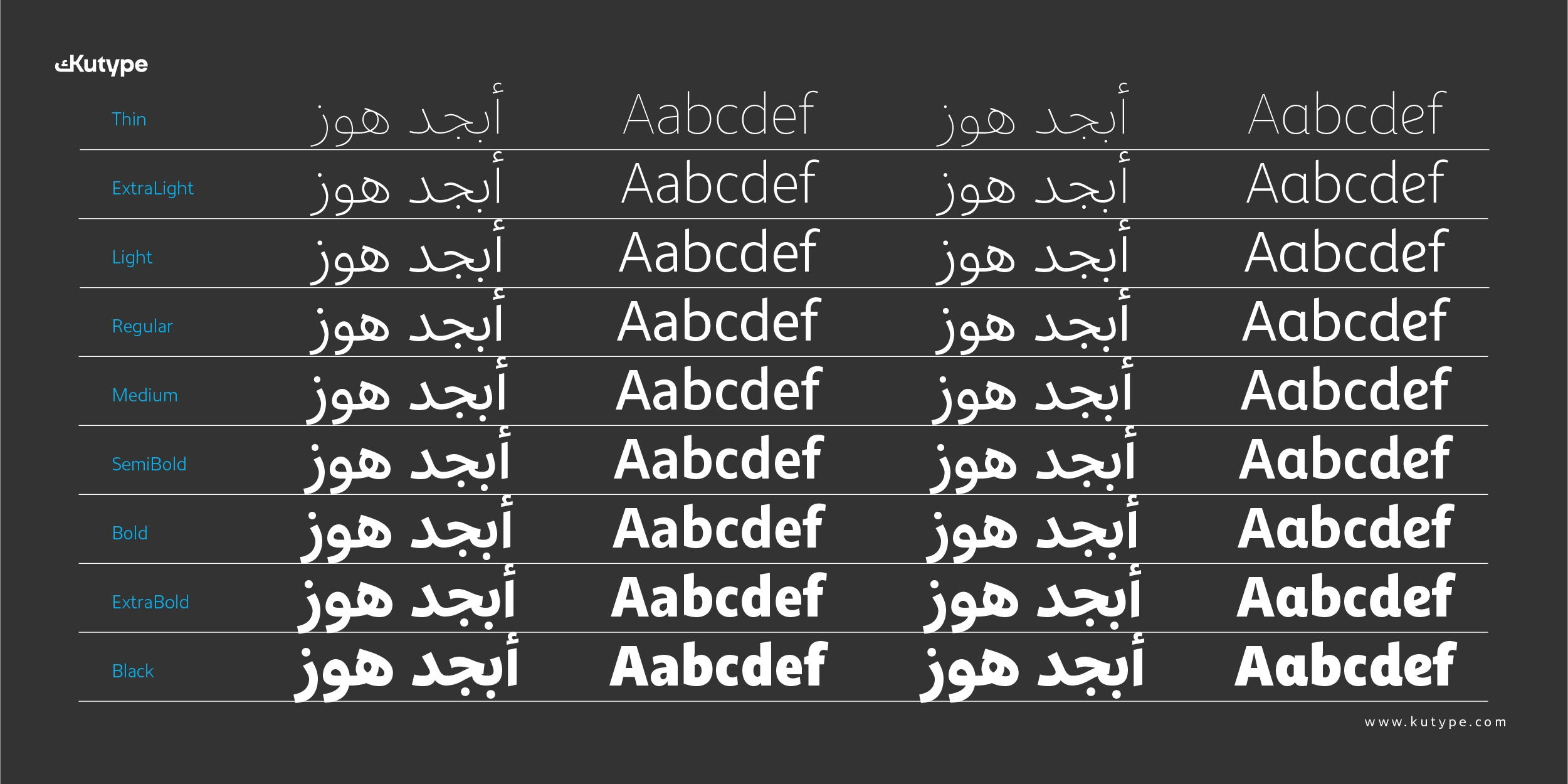
Zahir Sans Arabic
Upright Variable
100px
لكل خط موسيقاه الخاصة، ولكل شكل نبرته المميزة.
Zahir Sans Arabic
Upright Variable
100px
Every typeface has its own music, and every form its unique tone.
Zahir Sans Arabic
SemiBold
58px
الحروف ليست مجرد أدوات للكتابة، بل هي ملامح تحمل روح الزمن الذي ولدت فيه. فهناك خطوط تنبض بالحداثة، وأخرى تنطق بتراث عريق، وفي كل منها تختبئ قصة من الفن والمعنى.
Zahir Sans Arabic
SemiBold
64px
Letters are not merely tools for writing; they are features that carry the spirit of the era in which they were born.
Zahir Sans Arabic
Regular
17px
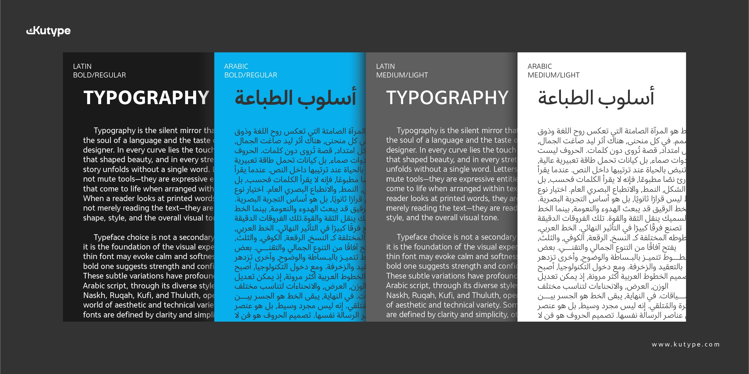
الحروف ليست مجرد أدوات للكتابة، بل هي ملامح تحمل روح الزمن الذي ولدت فيه. فهناك خطوط تنبض بالحداثة، وأخرى تنطق بتراث عريق، وفي كل منها تختبئ قصة من الفن والمعنى. إن التوازن بين الوزن، والاتساع، والمسافة، هو ما يمنح النص حياة متكاملة.
في فن الطباعة، يصبح الشكل رسالة بقدر ما يكون النص مضمونا. الحروف الغليظة تعبر عن القوة والوضوح، بينما تمنح الحروف الدقيقة إحساسا بالهدوء والرهافة. وبينهما يتجلى فن الإيقاع البصري الذي يجعل القراءة تجربة جمالية قبل أن تكون معرفية.
الحروف كالمرايا، تعكس روح المصمم كما تعكس ملامح النص. فحين ترص الكلمات بانتظام، يتحول السطر إلى لوحة هندسية نابضة بالإيقاع. إن الجمال في الطباعة لا يقتصر على الشكل الخارجي، بل يمتد إلى التفاصيل الصغيرة: من انحناءة دقيقة إلى مسافة محسوبة.
الخطوط الحديثة تذكرنا بالسرعة والدقة في عالمٍ رقمي، بينما الخطوط التقليدية تعيدنا إلى الدفء والجذور. وفي هذا التنوع تكمن قوة الطباعة؛ فهي جسر بين الماضي والمستقبل، وبين العين والقلب، وبين الفكرة وصداها البصري.
Zahir Sans Arabic
Regular
17px
Letters are not merely tools for writing; they are features that carry the spirit of the era in which they were born. Some typefaces pulse with modernity, while others speak with ancient heritage, and within each lies a story of art and meaning. Balance of weight, width, and spacing is what gives the text a complete life.
In the art of typography, form becomes as much a message as content. Bold letters express strength and clarity, while delicate strokes offer a sense of calm and refinement. Between them emerges the art of visual rhythm, making reading an aesthetic experience before it is an intellectual one.
Letters are like mirrors, reflecting the spirit of the designer as much as the character of the text. When words are aligned with order, the line transforms into a geometric canvas pulsing with rhythm. The beauty of typography lies not only in its outward form but also in its details: a subtle curve, a measured spacing.
Modern typefaces remind us of speed and precision in a digital world, while traditional ones bring us back to warmth and roots. Within this diversity lies the power of typography: it is a bridge between past and future, between eye and heart, between thought and its visual echo.
Buying Options
Bundle
Individual
License
Price
Total $0.00