Tafkir
Tafkir Font - A Neo-Grotesque Geometric Typeface for Publishing and Branding
Tafkir Font is a neo-grotesque sans serif typeface designed for content that demands clarity, structure, and long-term readability. Built on a geometric foundation with low stroke contrast, Tafkir offers a calm typographic voice suited for publishing, editorial design, and modern branding systems. Its presence is deliberate yet understated, allowing text to remain effortless to read while maintaining a confident and contemporary rhythm.
From printed materials such as books, magazines, and educational publications to digital reading environments like apps, ePub formats, and web interfaces, Tafkir delivers consistency across platforms. Rather than competing with content, the typeface stays in the background, supporting information with balance and visual stability.
Understanding the Neo-Grotesque Tradition
To understand Tafkir’s design approach, it is important to look at the neo-grotesque tradition. Neo-grotesque typefaces evolved as refinements of early grotesque sans serifs from the late 19th and early 20th centuries. While early grotesques were revolutionary, they often showed irregular proportions and uneven details.
Neo-grotesques introduced a more systematic and neutral visual language. With cleaner construction, low contrast, and consistent proportions, they became the foundation of modern corporate, editorial, and public communication. Typeface families such as Helvetica and Univers established this category as a standard for clarity and reliability.
Tafkir carries this legacy forward, translating neo-grotesque principles into a contemporary geometric font that works comfortably in long-form reading and structured branding environments.
Background and Development
Developed by Nur Syamsi and Bustanul Arifin, Tafkir grew from geometric research combined with extensive practical testing in Kutype. Early explorations were influenced by modernist principles and geometric typefaces such as Futura, focusing on how basic shapes could form a dependable typographic system.
However, Tafkir was never intended as a purely geometric display experiment. Through iterative refinement—adjusting proportions, spacing, and overall texture—the typeface evolved into a functional family designed for real publishing conditions. The goal was endurance: a font that performs consistently across long paragraphs, multilingual layouts, and screen-based reading environments.
Name Philosophy
The name Tafkir comes from the Arabic word تفكير, meaning thinking or reflection. This concept reflects the typeface’s role as a tool for thoughtful content—texts that require clarity, focus, and trust.
Rather than relying on expressive ornamentation, Tafkir emphasizes structure and restraint. Its identity aligns naturally with publishing, education, and branding, where tone and readability are more important than visual excess.
Design Details and Letter Structure
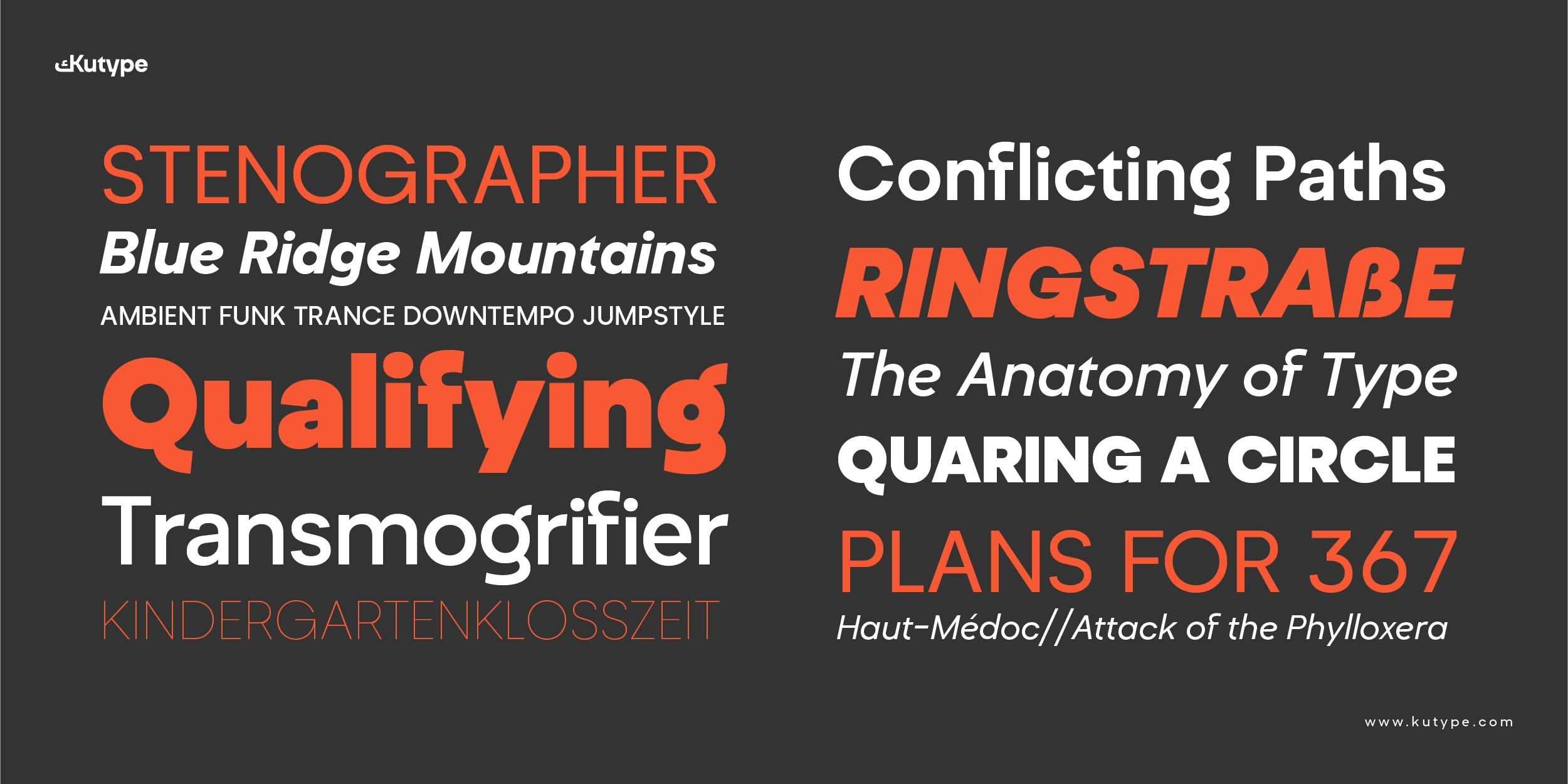
Tafkir is a neo-grotesque geometric font with low stroke contrast and carefully balanced proportions. Its letterforms are clean and sharp without feeling mechanical, ensuring comfort in extended reading scenarios.
The typeface maintains a consistent texture across sizes through:
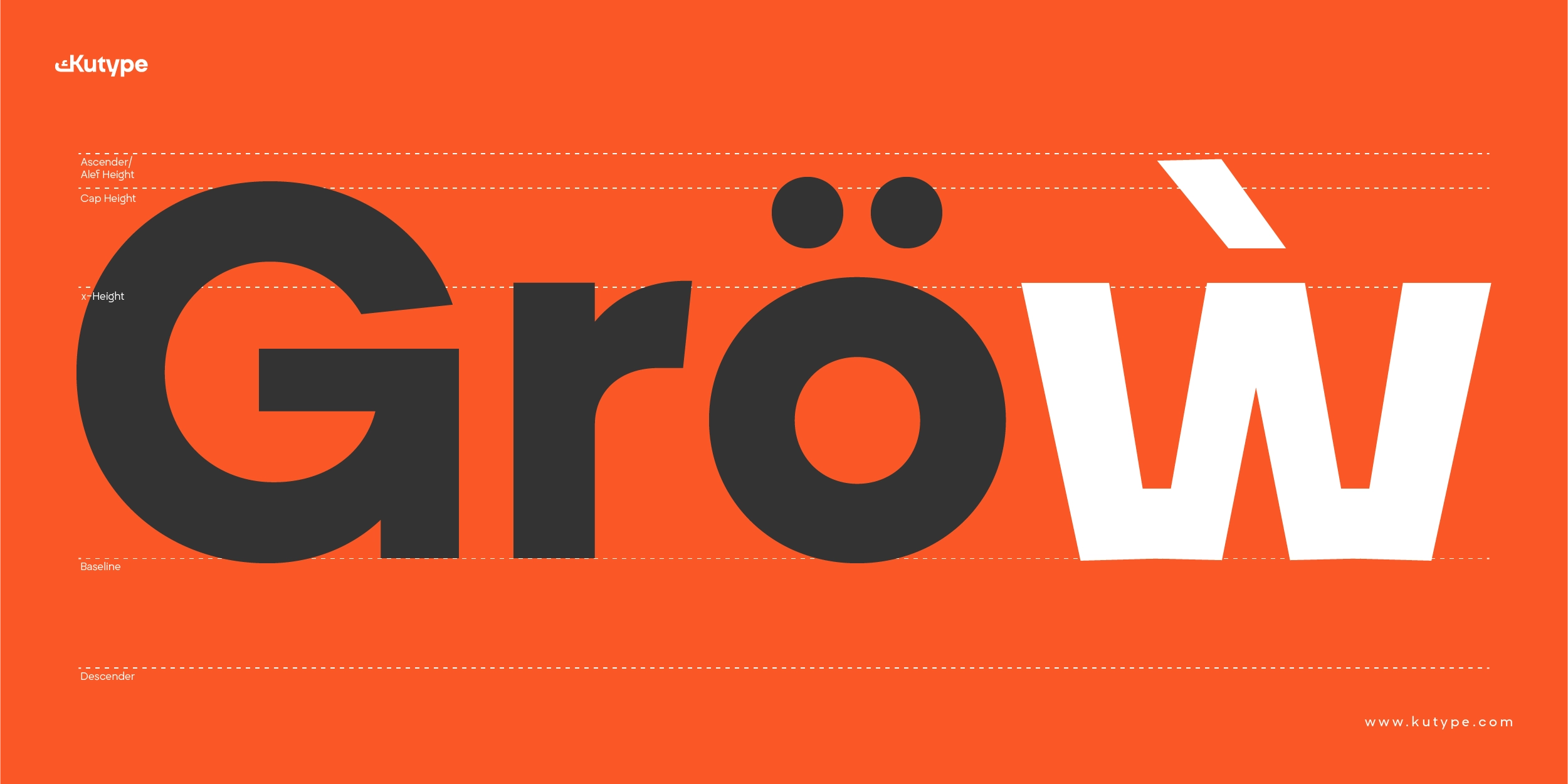
- Balanced x-height
- Clear ascenders and descenders
- Stable stems and open counters
- Controlled spacing and kerning
These details support smooth reading flow and reduce eye fatigue, making Tafkir especially suitable for text-heavy layouts.
Stylistic Alternates and Visual Flexibility
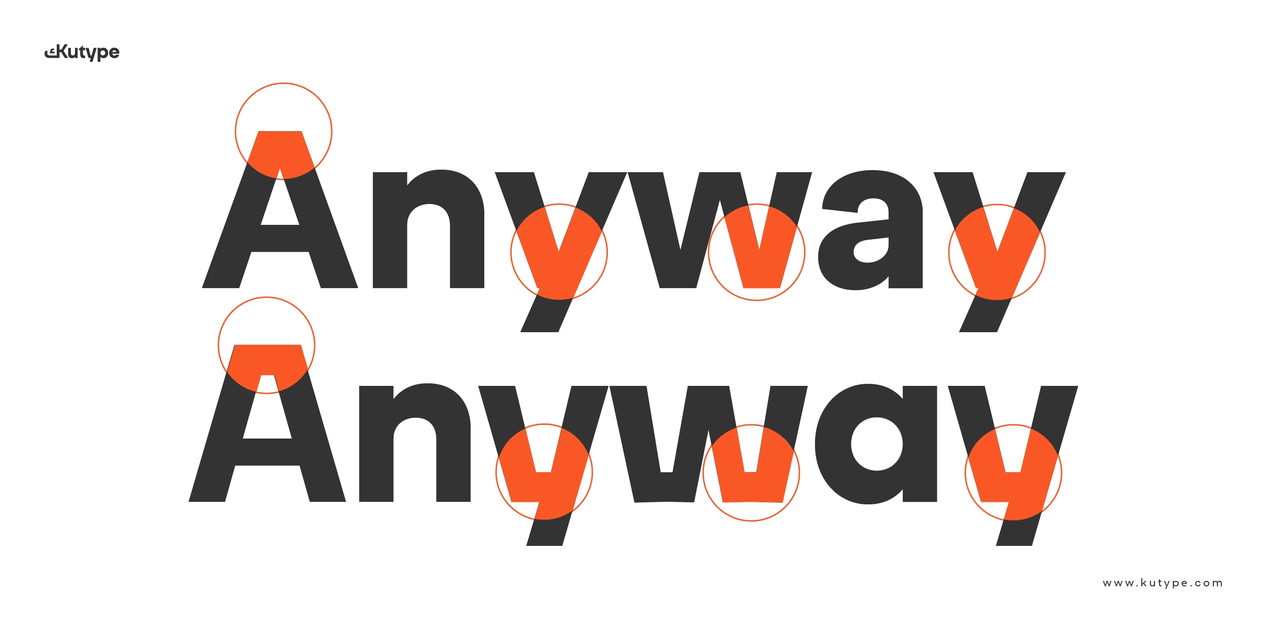
Both scripts include stylistic alternates (ss01) featuring wider, ink-trap-inspired openings. These alternates subtly enhance clarity in dense layouts or smaller sizes while adding a contemporary edge.
In Latin, specific characters such as A, K, M, V, W, X, and Y also feature distinctive stylistic alternates, allowing designers to introduce controlled expression without breaking typographic consistency.
Variable Range and OpenType Features
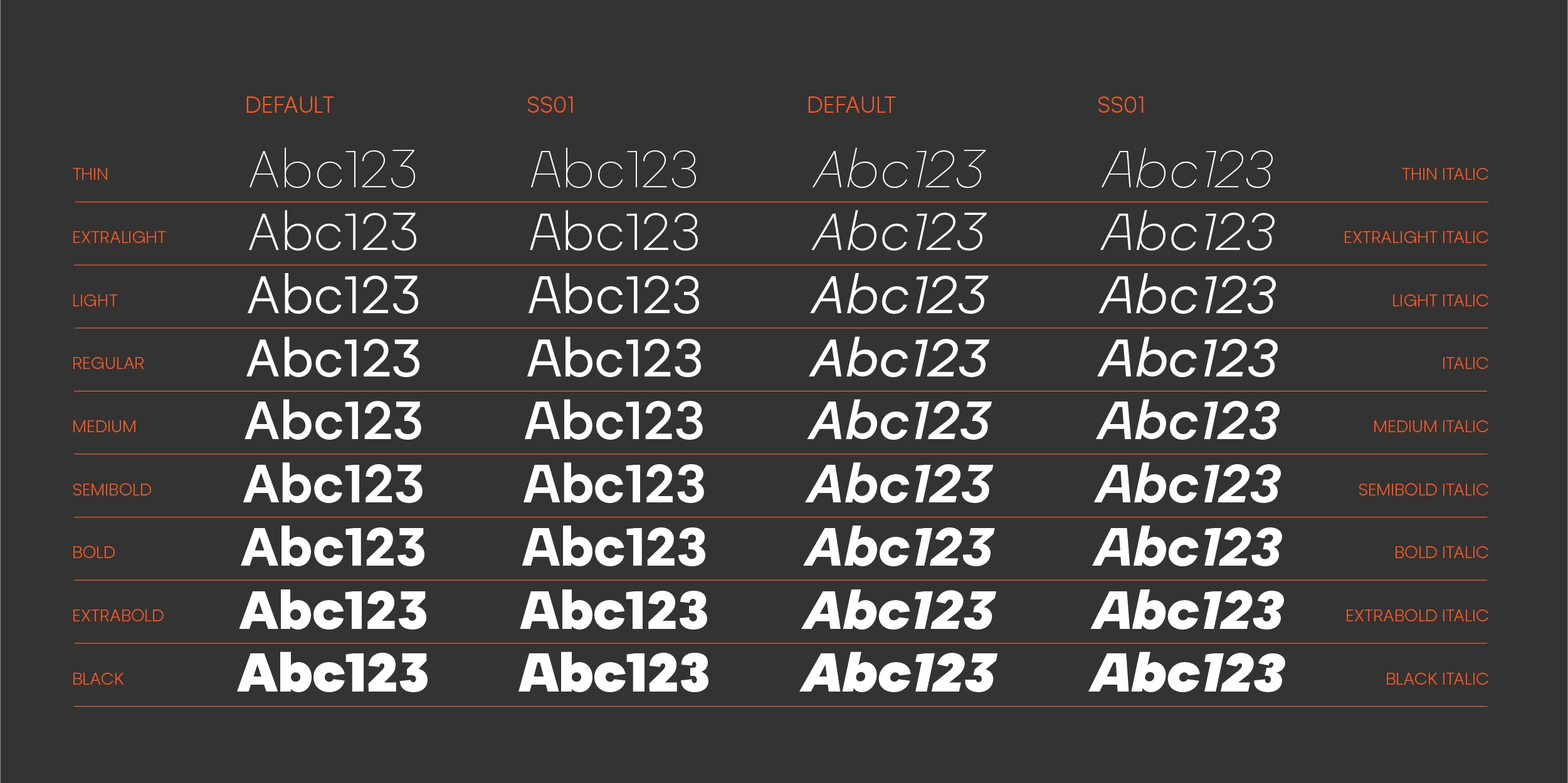
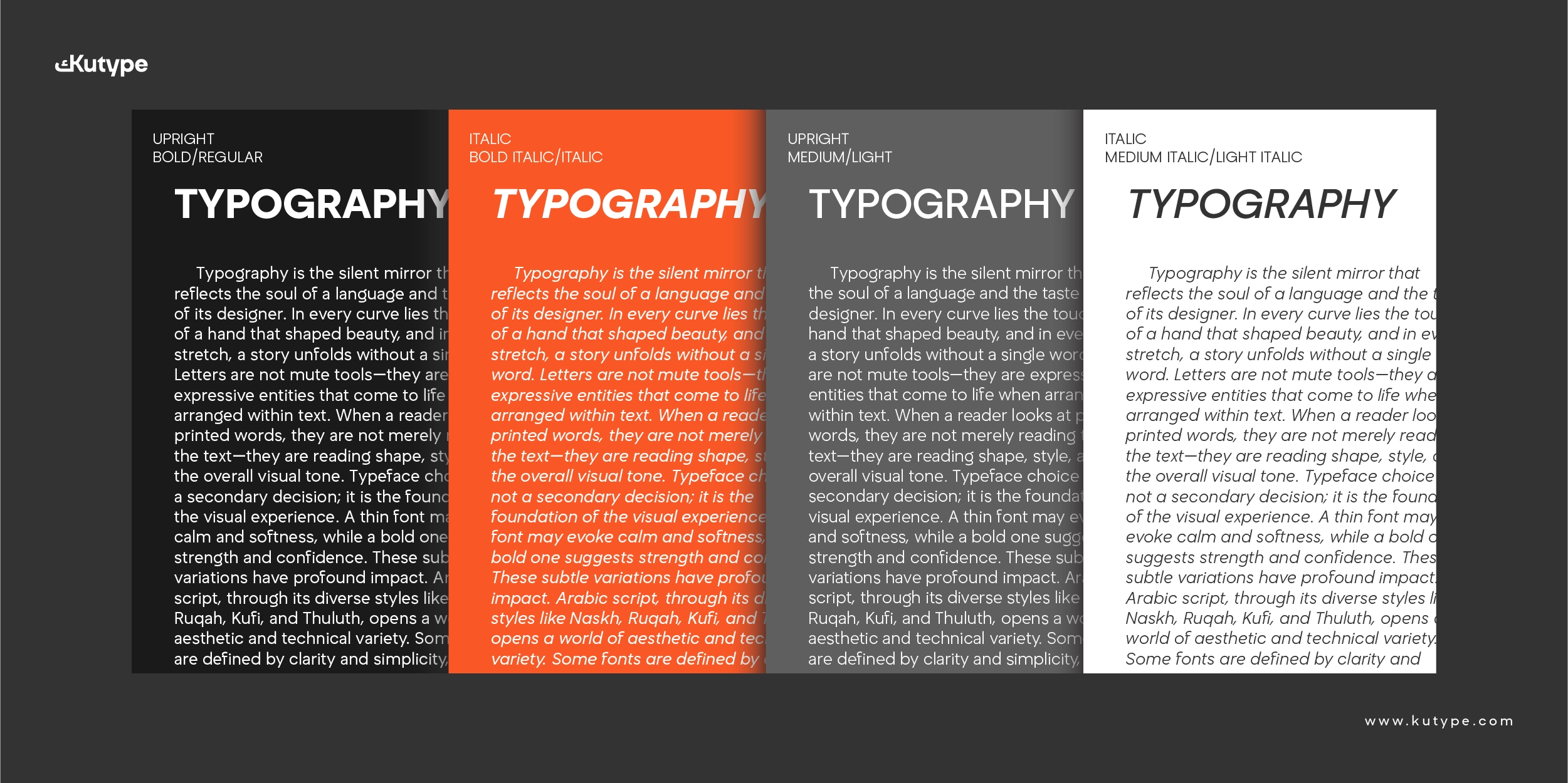
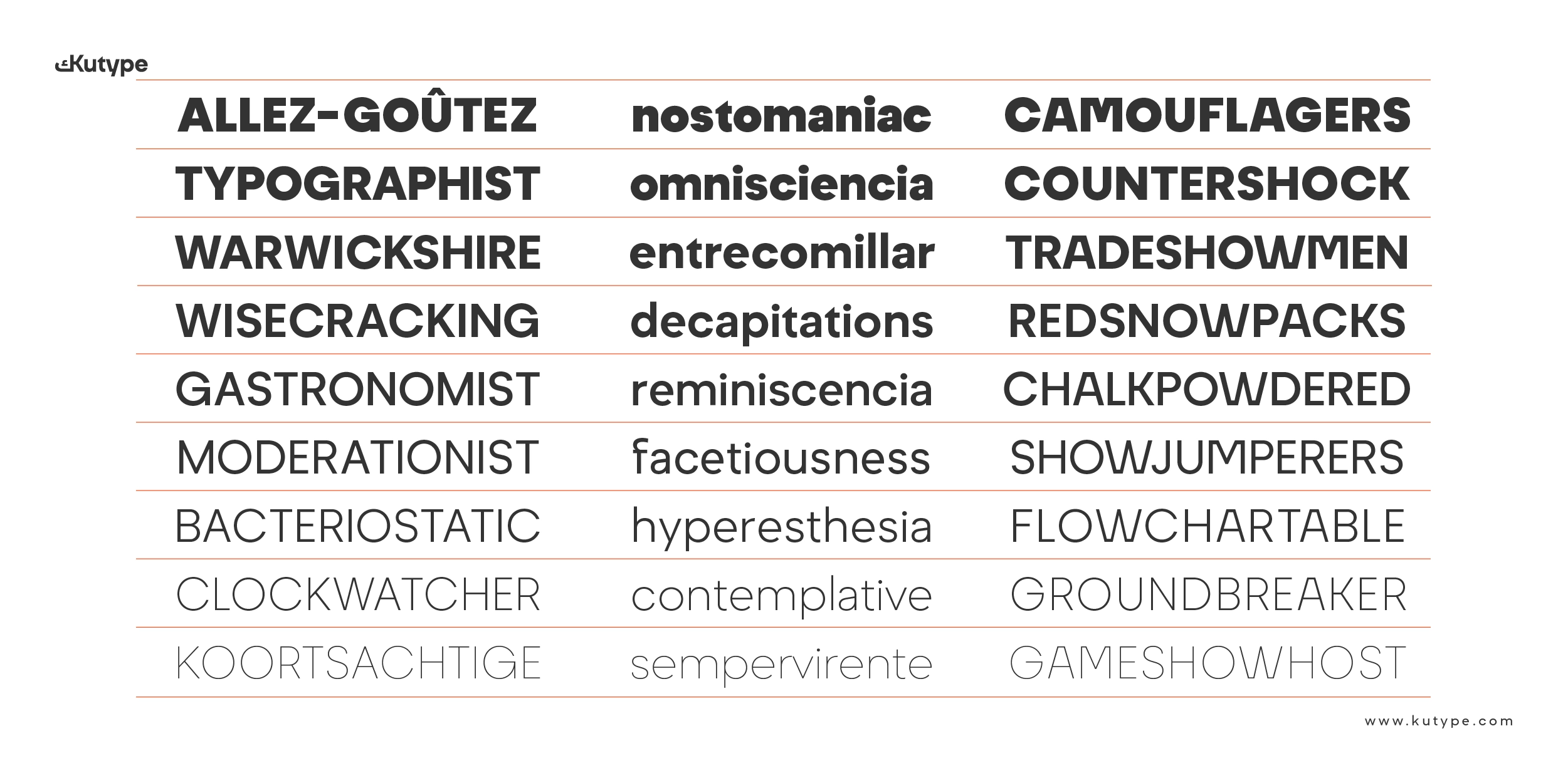
Tafkir is available in a complete family of 18 styles, ranging from Thin to Black, including expressive italics for hierarchy and emphasis. This wide range supports complex editorial systems as well as flexible branding needs.
The font includes comprehensive OpenType features, such as:
- Ligatures (liga)
- Contextual Alternates (calt)
- Stylistic Sets (ss01–ss03)
- Access All Alternates (aalt)
- Fractions (frac)
- Ordinals (ordn)
- Subscript and Superscript (subs, sups)
- Case-Sensitive Forms (case)
- Localized Forms (locl)
With over 1,200 glyphs, Tafkir is equipped for professional, multilingual, and long-term typographic workflows.
Use Cases: Publishing and Branding
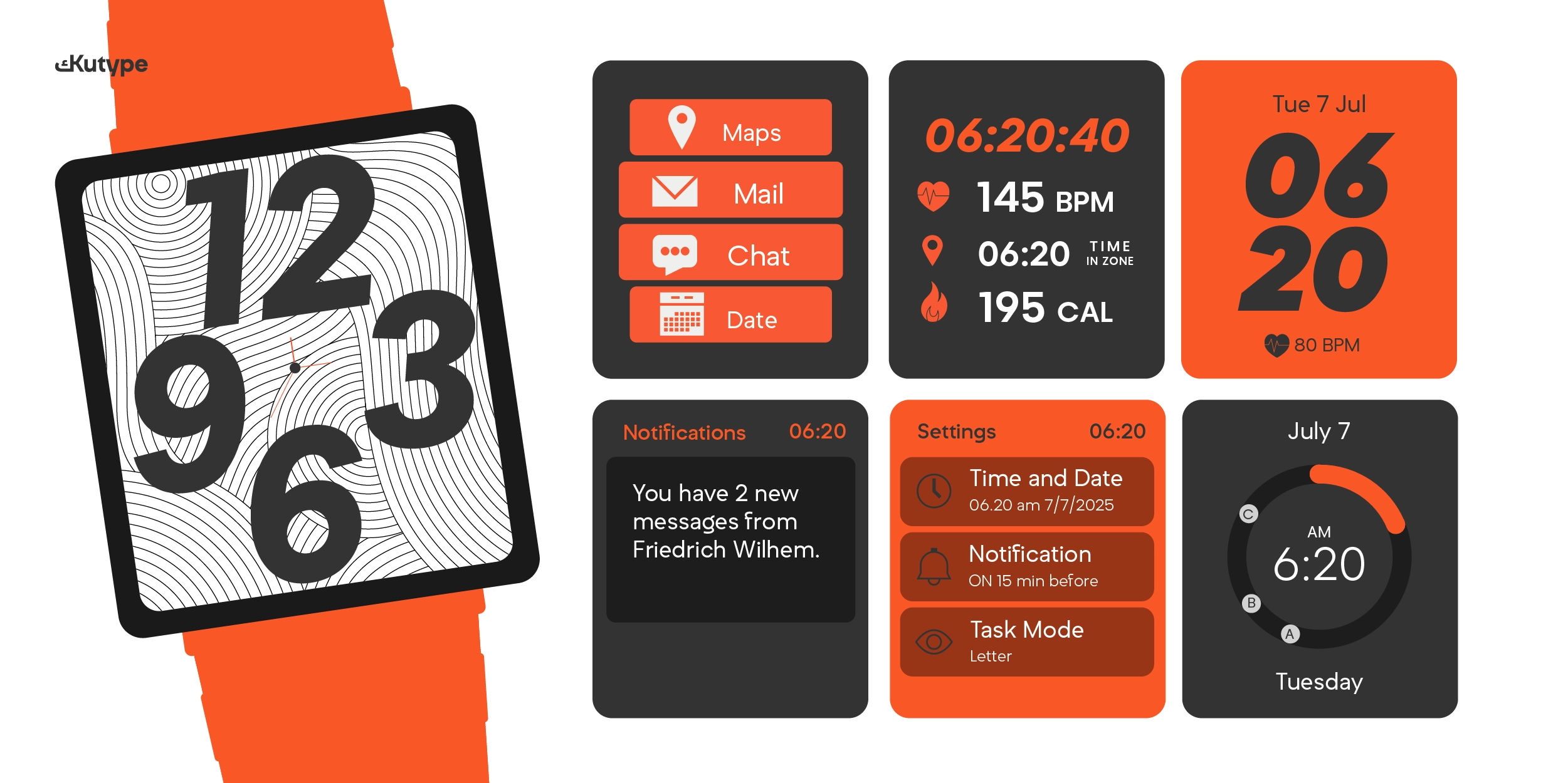
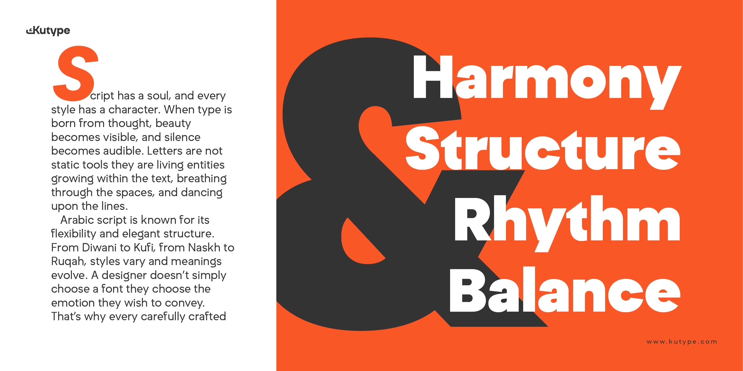
As a font for publishing, Tafkir excels in magazines, books, essays, reports, and long-form articles where consistency and readability are essential. Its neutral tone supports content without distraction, allowing readers to focus on meaning rather than form.
In educational and academic publishing, Tafkir’s structured rhythm and calm appearance make it well suited for textbooks, institutional materials, and research-oriented content.
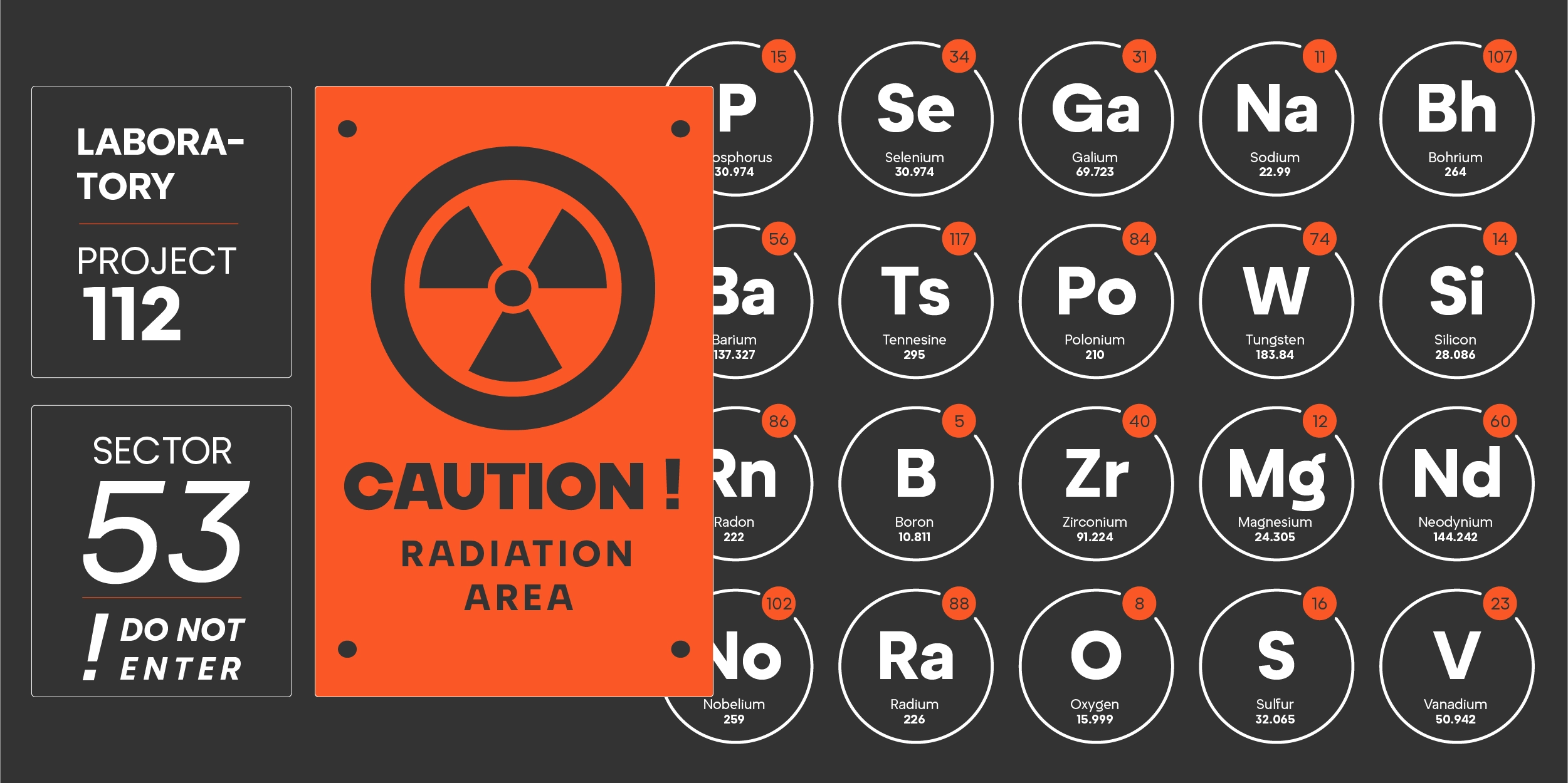
Tafkir also extends naturally into branding and identity systems. For brands seeking a modern, rational, and trustworthy tone, Tafkir provides a solid typographic foundation. Its geometric clarity and neo-grotesque neutrality allow it to function effectively in logos, packaging, motion design, and supporting brand typography without feeling overly decorative.
Professional Advantages
Tafkir offers several advantages for designers and publishers:
- Optimized readability for long-form text
- Wide stylistic range for clear hierarchy
- Advanced OpenType support for refined typography
- Consistent performance across print and digital media
- A neutral yet contemporary voice suitable for branding
These qualities make Tafkir a reliable choice for projects that demand both aesthetic control and functional durability.
Conclusion
Tafkir Font is a calm, structured neo-grotesque geometric typeface designed for modern publishing and branding needs. With its wide family range, thoughtful proportions, and advanced OpenType features, it provides a dependable typographic system for long-form reading, digital platforms, and contemporary identity design. For projects that require a slightly different tone, it can also be paired or compared with other Kutype releases such as Zahir Font, which offers a distinct typographic character within the same modern ecosystem.
Focused on clarity and reflection, Tafkir demonstrates that neutrality can still carry depth. It is a font that supports content with confidence—allowing ideas, not decoration, to take center stage.
Font Name
Tafkir
Designer
Nur Syamsi, Bustanul Arifin
Version
Build 1.0 - 2025
Type Category
Sans Serif, Display
Glyph Count
609+
Year Published
August 2025
Supported Languages
Afrikaans, Albanian, Arabic, Asturian, Asu, Basque, Bemba, Bena, Bosnian, Breton, Catalan, Cebuano, Chiga, Colognian, Cornish, Corsican, Croatian, Czech, Danish, Dutch, Embu, English, Esperanto, Estonian, Faroese, Filipino, Finnish, French, Friulian, Galician, Ganda, German, Gusii, Hungarian, Icelandic, Ido, Inari Sami, Indonesian, Interlingua, Irish, Italian, Javanese, Jju, Jola-Fonyi, Kabuverdianu, Kalaallisut, Kalenjin, Kamba, Kikuyu, Kinyarwanda, Kurdish, Kurdish, Sorani, Latvian, Lithuanian, Lojban, Low German, Lower Sorbian, Luo, Luxembourgish, Luyia, Machame, Makhuwa-Meetto, Makonde, Malagasy, Malay, Maltese, Manx, Māori, Mazanderani, Meru, Mohawk, Morisyen, North Ndebele, Northern Sami, Northern Sotho, Norwegian Bokmål, Norwegian Nynorsk, Nyanja, Nyankole, Occitan, Oromo, Persian, Polish, Portuguese, Quechua, Romanian, Romansh, Rombo, Rundi, Rwa, Samburu, Sango, Sangu, Sardinian, Scottish Gaelic, Sena, Shambala, Shona, Sicilian, Slovak, Slovenian, Soga, Somali, South Ndebele, Southern Sotho, Spanish, Sundanese, Swahili, Swati, Swedish, Swiss German, Taita, Taroko, Teso, Tsonga, Tswana, Turkish, Turkmen, Upper Sorbian, Urdu, Vunjo, Walloon, Walser, Welsh, Western Frisian, Wolof, Xhosa, Zulu
Tafkir
106px
1.2
0.0
Tafkir
49px
1.2
0.0
Tafkir
17px
1.2
0.0
Size
48px
TafkirThin
TafkirThin Italic
TafkirExtraLight
TafkirExtraLight Italic
TafkirLight
TafkirLight Italic
TafkirRegular
TafkirItalic
TafkirMedium
TafkirMedium Italic
TafkirSemiBold
TafkirSemiBold Italic
TafkirBold
TafkirBold Italic
TafkirExtraBold
TafkirExtraBold Italic
TafkirBlack
TafkirBlack Italic
TafkirUpright Variable
TafkirItalic Variable
Glyphs Preview
Tafkir
Buying Options
Total $0.00