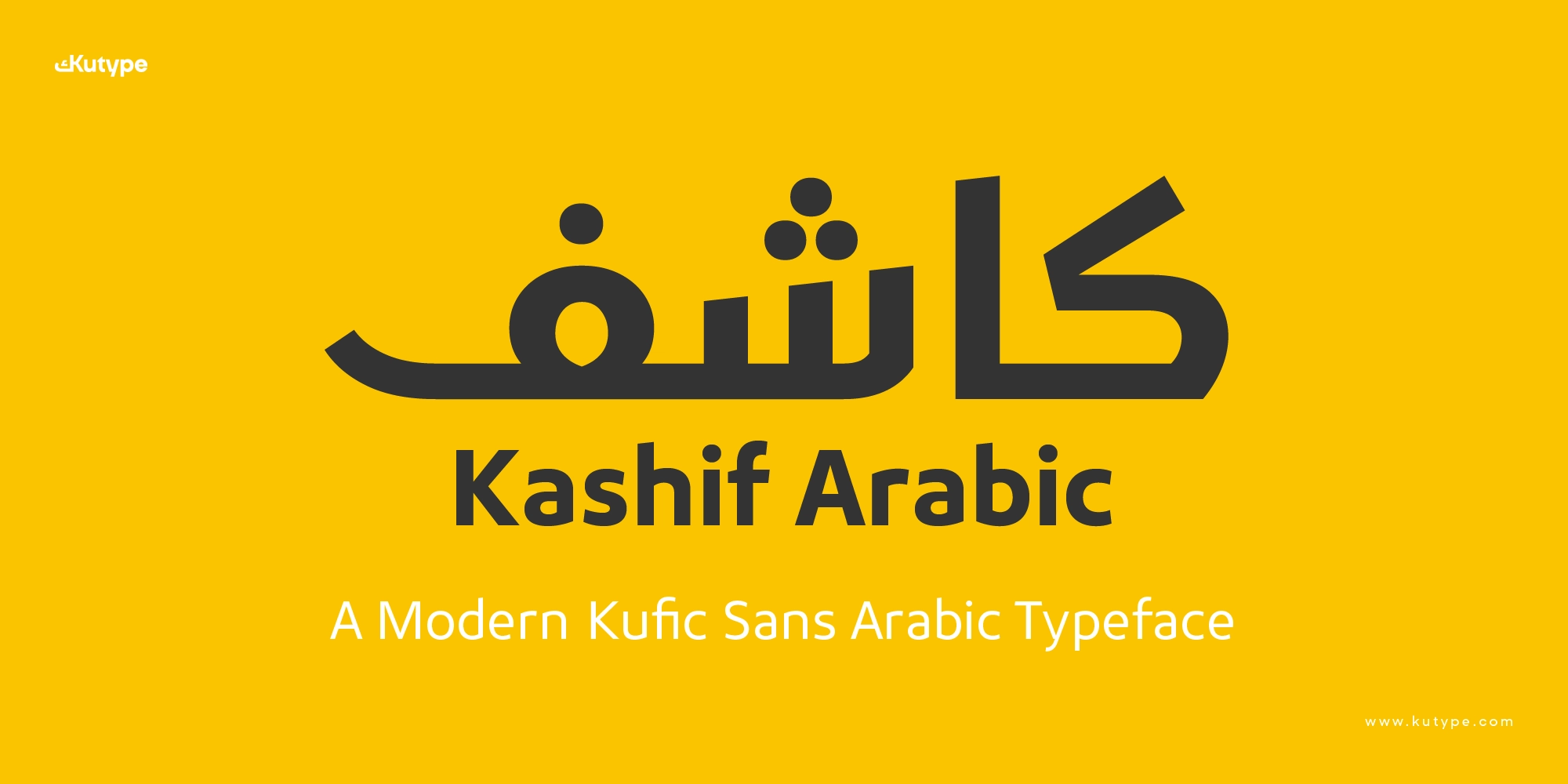
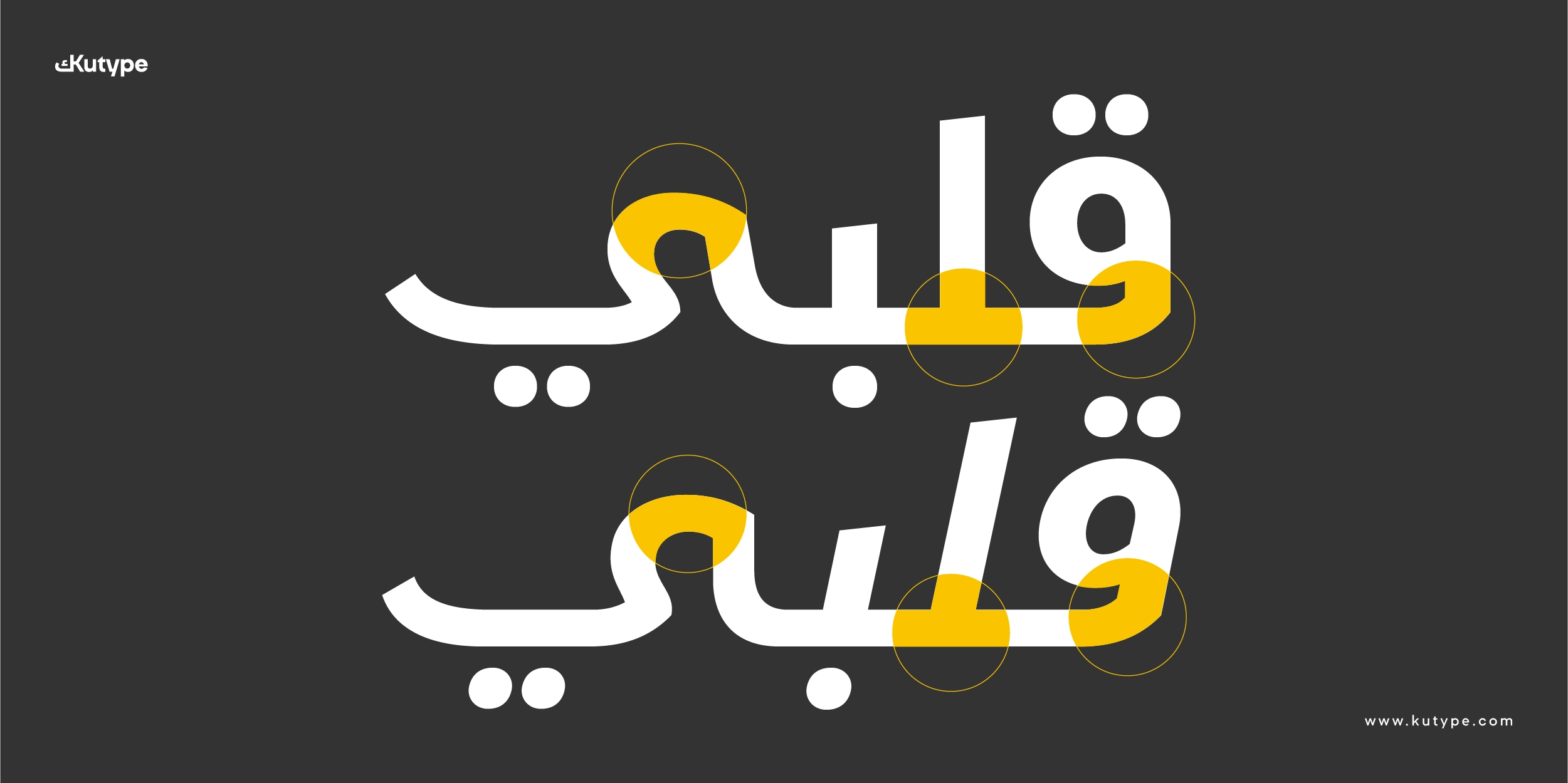
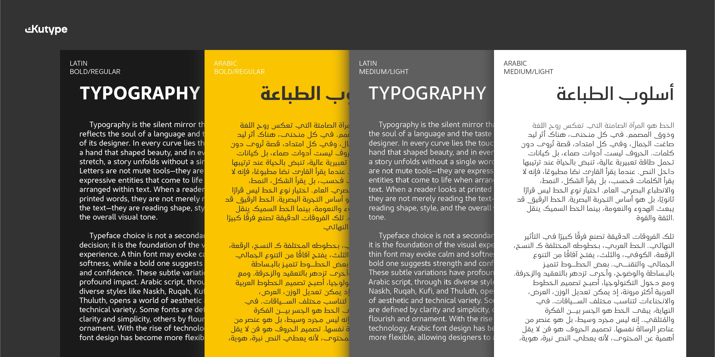
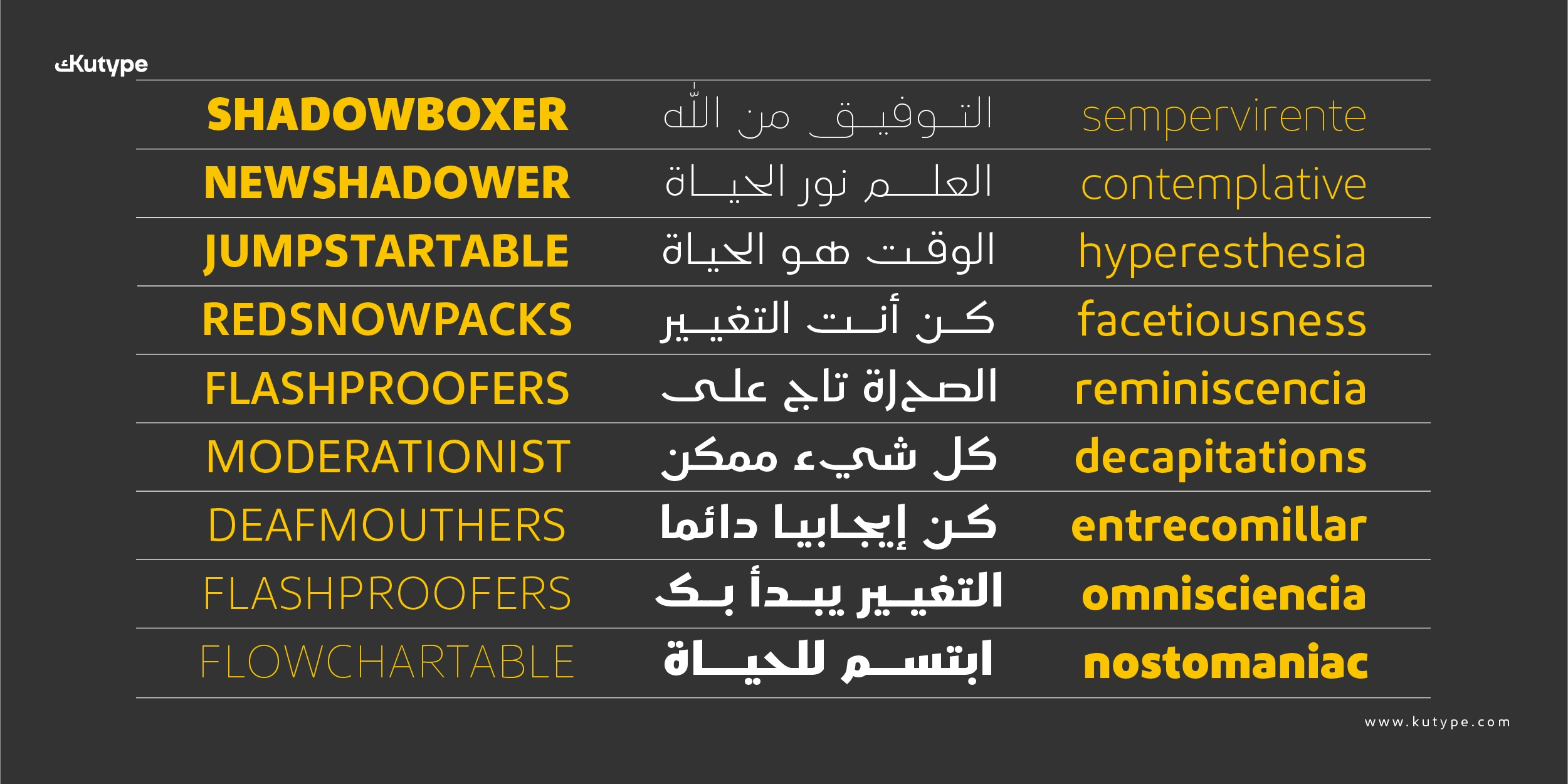
Kashif Arabic font is a modern spurless typeface built around clarity, structure, and visual confidence. It is a more complete version of Kashif—originally a Latin typeface—now expanded with a fully developed Arabic script to create a cohesive bilingual system. Drawing formal inspiration from classical Early Kufic traditions, it translates historical geometric discipline into a contemporary digital system suited for branding, logo design, and multilingual identity work.
Developed by Nur Syamsi and Bustanul Arifin, Kashif Arabic is crafted to deliver precise, distinctive, and highly recognizable letterforms for modern brand environments—where typography must function with authority, consistency, and cultural depth.
Name Philosophy
The name Kashif (كاشف) originates from Arabic and means revealer, opener, or something that uncovers what is hidden. It derives from the verb كشف (kashafa), meaning to reveal or clarify.
This meaning directly reflects the design philosophy behind the typeface. Kashif’s forms are intentionally clean, transparent, and structurally honest—removing unnecessary visual noise so brand identity can appear clear and direct. Just as its name suggests, Kashif is designed to visually “reveal” information with refinement and confidence.
Find more inspiration with Tafkir Arabic, a carefully crafted Kufic Geometric font sharing a similar visual mood.
Bilingual Design Foundation
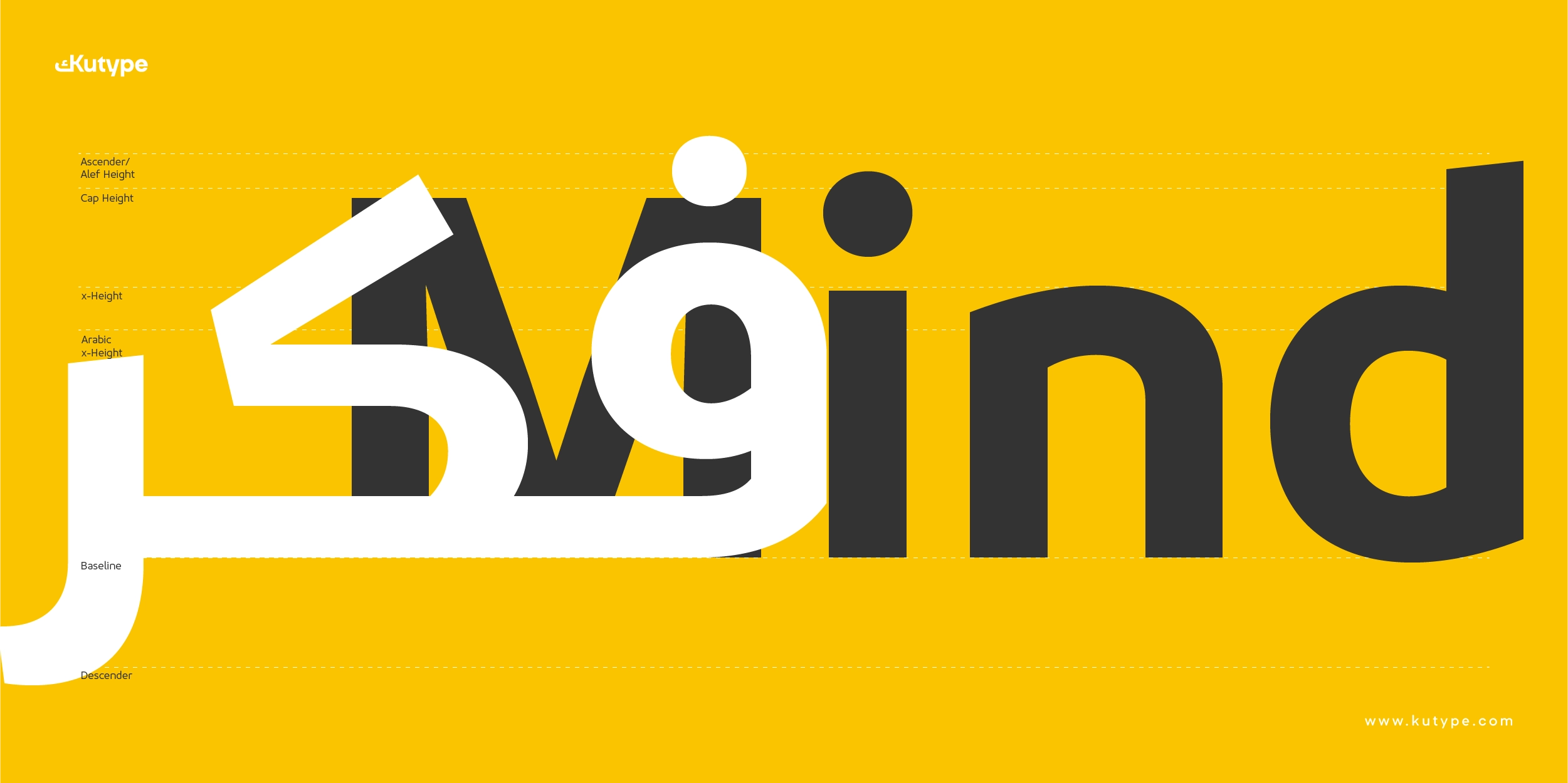
Kashif Arabic is built as a bilingual system, supporting both Latin and Arabic scripts within one cohesive typographic structure. It follows the same foundational logic as its Latin counterpart, ensuring strong consistency across multilingual brand systems.
Harmony between scripts is achieved through:
- Controlled proportions
- Balanced stroke rhythm
- Consistent geometric tone
- Parallel weight distribution
This alignment is essential for global brands that require a unified identity across languages. Kashif allows Arabic typography to integrate seamlessly into international branding while maintaining cultural authenticity.
Historical Inspiration: Early Kufic & Script Evolution
Kashif Arabic font draws structural inspiration from Early Kufic Arabic—historically known for geometric clarity, strong horizontality, and minimal ornamentation.
Rather than replicating classical decorative Kufic, Kashif reinterprets its structural principles for contemporary use. Early Kufic itself evolved from earlier writing traditions such as Mashq, which appeared in early Muslim communities in Mecca and Medina during the 7th century for writing the Quran. As the script spread to Basra and Kufa, it became more systemized—introducing stronger baselines, elongated horizontals, and simplified geometry.
Over centuries, Kufic gradually gave way to more fluid scripts like Naskh. Yet its structural clarity and stability remain influential in modern Arabic kufi font design. Kashif channels that historical clarity into a modern spurless construction—bridging tradition and contemporary branding needs.
Spurless Construction & Letterform Strategy
A defining characteristic of Kashif is its spurless construction.
By removing small projecting stroke details (spurs), the letterforms appear smoother, cleaner, and more contemporary. This approach:
- Strengthens silhouette recognition
- Improves scalability for logos
- Enhances clarity in digital environments
- Creates a more fluid connection between Arabic letterforms
Despite its minimal detailing, Kashif maintains a solid geometric backbone inspired by Kufic structure. The moderate contrast between stems and curves ensures readability while preserving a modern visual tone.
Readability remains central to its design. Letter proportions are carefully calibrated to maintain legibility across various sizes—whether used in compact brand signatures or large-scale signage.
Design Performance for Branding & UI Systems
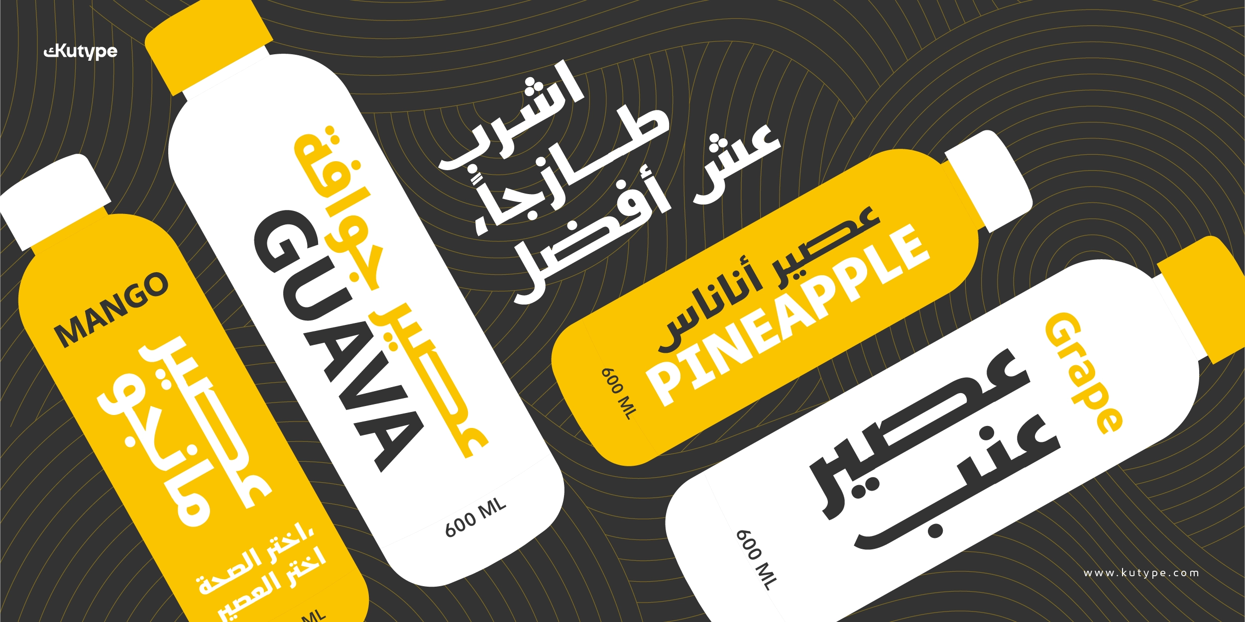
Typography in branding must perform across diverse media—packaging, websites, apps, signage, and marketing materials. Kashif Arabic font is engineered to maintain clarity and character in both print and digital production. Its controlled spacing and balanced stroke rhythm allow it to function effectively in:
- Corporate identities
- Technology and startup branding
- Fashion and lifestyle logos
- Premium packaging
- Multilingual global brand systems
- Modern user interfaces
The clean geometry also makes it suitable for efficient UI systems, where clarity and scalability are essential.
Weights, Styles & Variable Flexibility
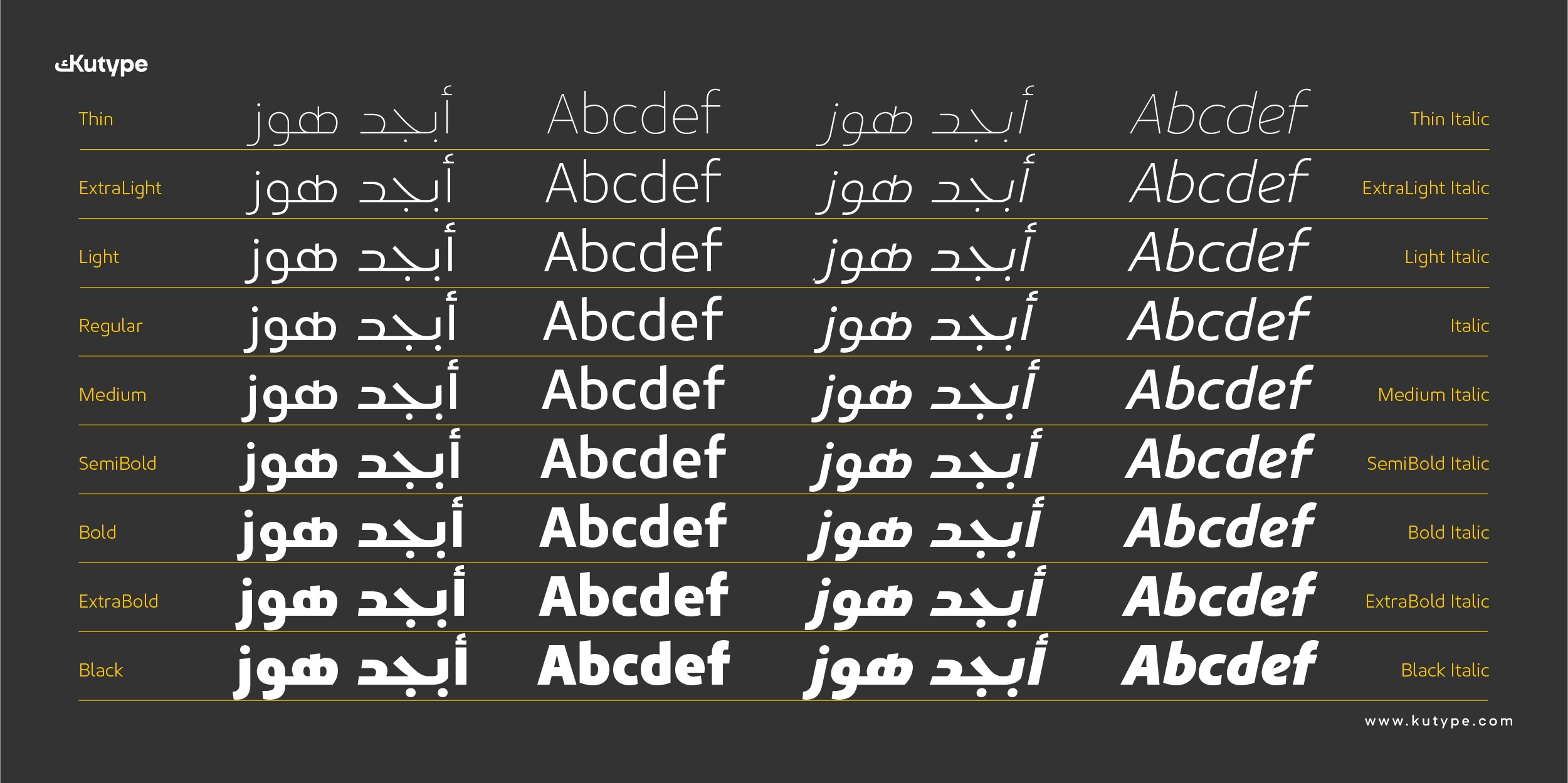
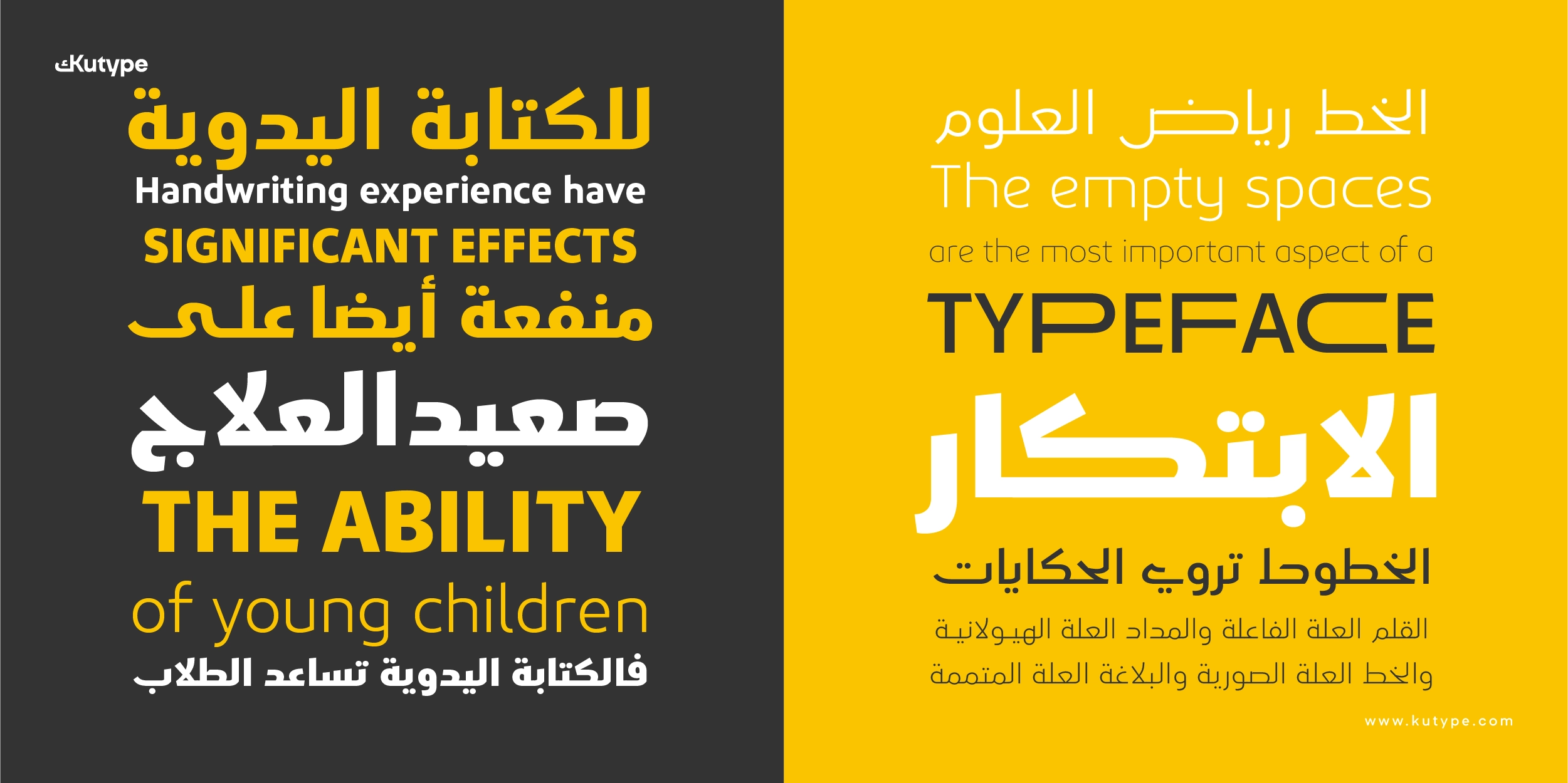
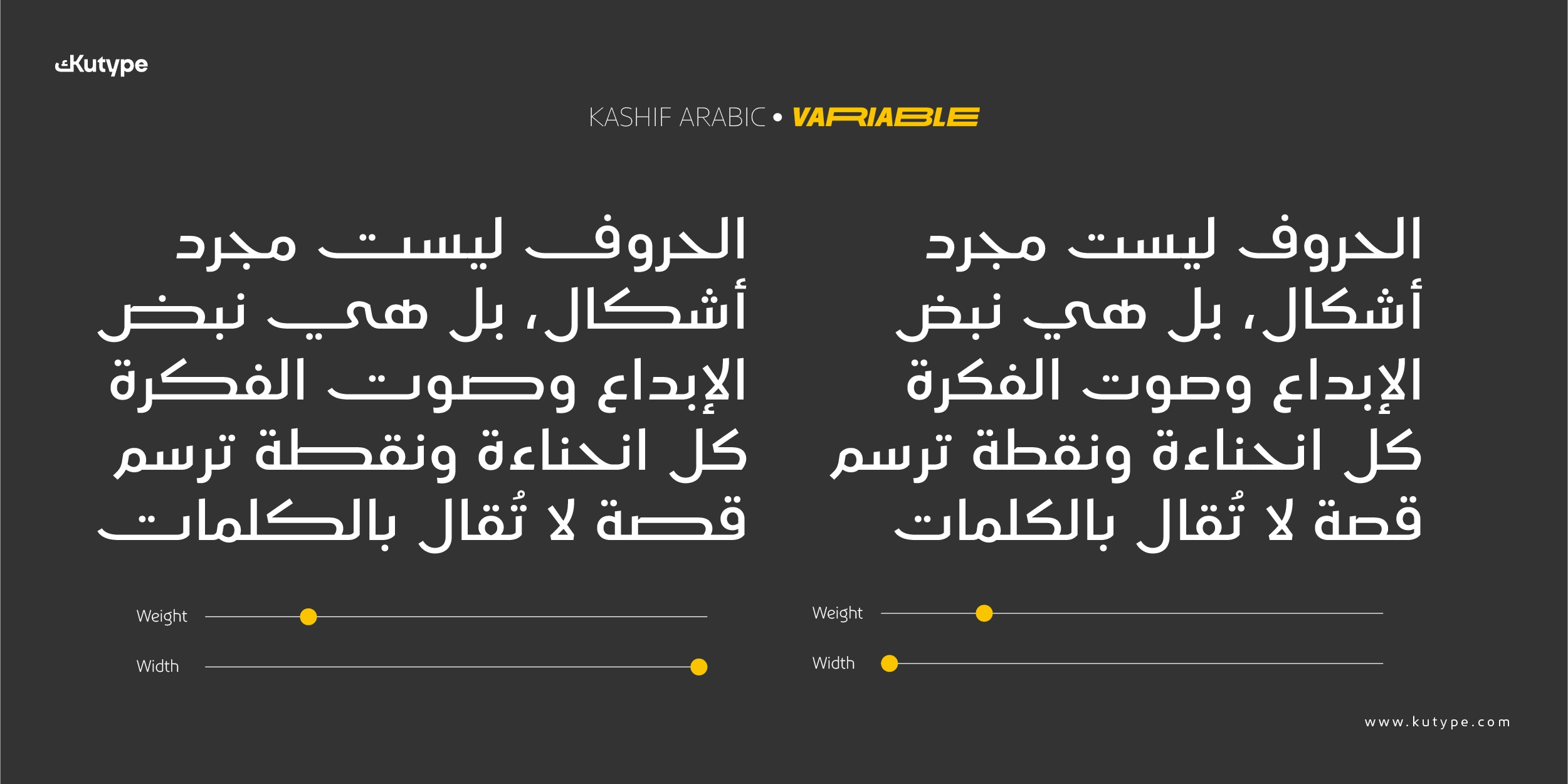
Kashif Arabic, designed by Kutype, is available in 18 styles, ranging from Thin to Black, including Italics, as well as a fully functional variable font.
The range of weights enables designers to build clear hierarchy within brand systems:
- Lighter weights offer refinement and elegance
- Heavier weights create strong logo presence
Variable Font Capabilities
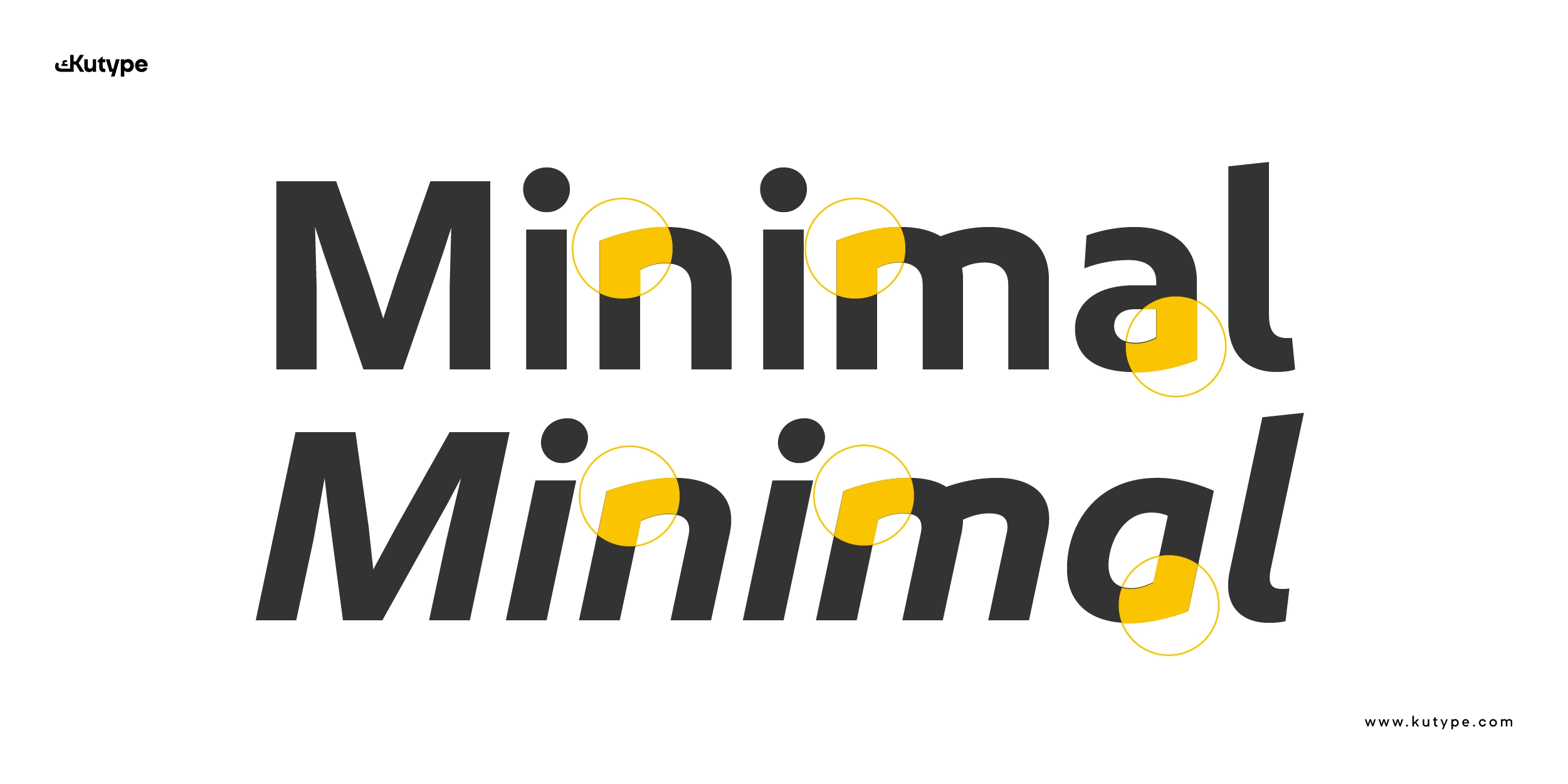
The variable version offers advanced flexibility, including extendable characters for refined logo composition and visual balance.
Among the extendable characters:
Latin Uppercase:
B, C, D, E, F, H, I, K, O, P, R, T, U
Latin Lowercase:
c, h, m, n, u, w
Arabic:
Beh (ب), Teh (ت), Theh (ث), Sad (ص), Dad (ض), Feh (ف), Kaf (ك), Yeh (ي)
This feature allows designers to subtly adjust proportions for more controlled identity layouts—particularly valuable in logo customization.
OpenType & Technical Features
Kashif Arabic includes professional OpenType functionality to support advanced typography:
- Fractions (frac)
- Ligatures (liga)
- Contextual Alternates (calt)
- Stylistic Sets (ss01)
- Localized Forms (locl)
- Ordinals (ordn)
- Subscript (subs)
- Superscript (sups)
- Case-sensitive Forms (case)
Webfont support (TTF, OTF, WOFF, WOFF2) ensures consistent performance across digital platforms and modern web environments.
Create consistent multilingual branding by combining this font with Kashif for the Latin script.
Conclusion
Kashif Arabic font is a focused typographic solution for branding and logo license use. By combining the structural heritage of Early Kufic, the efficiency of a spurless construction, bilingual harmony, and advanced variable capabilities, it offers clarity, flexibility, and cultural depth in one cohesive system.
It stands as a modern Arabic typeface designed not merely to decorate—but to reveal identity with precision and confidence.